Know your type: Gill Sans
Comments: +
October 1 2009
")
Called the “Helvetica of England,” the sixth installment in our ‘Know your type’ series is the humanist sans-serif Gill Sans.
Influenced by the ‘Underground’
The history of Gill Sans stems from Edward Johnston’s iconic typeface, Johnston Sans, designed for the London Underground in 1913. Eric Gill, who had studied under Johnston at London’s Central School of Arts and Crafts, later became a friend and apprentice—and even had a small role assisting in creation of the proprietary typeface.
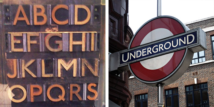
Left: Johnston Sans printing blocks now on display at the London Transport Museum, 1913 (Photo: Kaihsu Tai, Wikipedia); Right: London's Underground roundel set in Johnston Sans (often confused as Gill Sans), designed 1919 (Photo: danorbit, Flickr)
Creating a ‘fool-proof’ typeface
Not completely satisfied with Johnston’s work, Gill set out to create the perfect, legible typeface.
The first notable attempt to work out the norm for plain letters was made by Mr Edward Johnston when he designed the sans-serif letter for the London Underground Railways. Some of these letters are not entirely satisfactory, especially when it is remembered that, for such a purpose, an alphabet should be as near as possible ‘fool-proof’… as the philosophers would say—nothing should be left to the imagination of the sign-writer or enamel-plate maker.
-Eric Gill, Essay on Typography, published 1931
Drawing heavily on Johnston’s work, Gill first experimented with his ‘improvements’ in 1926 when he hand-painted lettering for a bookshop sign in his hometown, Bristol. Gill also sketched a guide for the bookshop owner, Douglas Cleverdon, who later published the work in A Book of Alphabets for Douglas Cleverdon.
The alphabet, which at the time only contained uppercase letters, was noticed by Stanley Morison for its commercial potential. A Monotype advisor, Morison commissioned Gill to develop a complete font family to compete with the sans-serif designs released by German foundries fueled by the overwhelming success of Futura. The font was released commercially by Monotype in 1928 as Gill Sans.
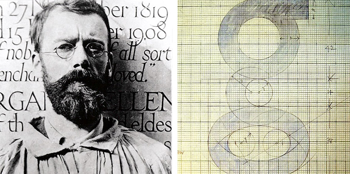
Left: Eric Gill as a young man, 1908 (Photo: Harry Ransom Center); Right: Drawing by Eric Gill, 1933 (Photo: St Bride Library via Fontblog.de)
While his personal life was later discovered to be rather controversial, Eric Gill (born 1882 as Arthur Eric Rowton Gill, died 1940) was an important British sculptor, artist, and typeface designer who also gave us Perpetua and Joanna (named after one of his daughters), among others.
The Helvetica of England
Gill Sans rose to popularity in 1929 when it became the standard typeface for the London and North Eastern Railway (LNER), appearing on everything from locomotive nameplates to time tables.
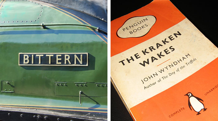
Left: LNER Bittern’s nameplate set in Gill Sans, built 1937 (Photo: Crowcombe Al, Flickr); Right: The Kraken Wakes published by Penguin Books in 1955 (Photo: duncan, Flickr)
The typeface was used in 1935 by designer Edward Young on the now iconic Penguin Books jacket design, putting Gill Sans on bookshelves around the world.
Many other notable companies (particularly in England) adopted Gill Sans as a corporate typeface by the mid-1900’s, including the BBC, British Railways, and ultimately Monotype themselves—making the typeface Monotype's fifth best seller of the twentieth century.
A diverse family
Originally released as metal type, over 36 derivatives emerged between 1929 and 1932—many of which were created by the Monotype drawing office (with input by Gill). The typeface is renowned for its inconsistencies between weights, as they were not mechanically produced from a single design (opposed to others like Helvetica).
…each weight retains a distinct character of its own. The light font, with its heavily kerned ‘f’ and tall ‘t’, has an open, elegant look. The regular font has a more compact and muscular appearance, with its flat-bottomed ‘d’, flat-topped ‘p’ and ‘q’, and short, triangular-topped ‘t.’ The bold font tends to echo the softer, more open style of the light, while the extra bold and ultra bold have their own vivid personalities.
-Monotype Imaging Inc, Hidden Gems: Gill Sans
The Gill Sans family ranges from Light to the exaggerated Ultra Bold—“because every advertisement has to try and shout down its neighbors,” Gill explains in Essay on Typography.

Gill’s lettering is based on classic roman proportions, which give the sans-serif a less mechanical feel than its geometric contemporaries. The typeface was initially recommended for advertising and headline use, but as the public got used to reading sans-serif, Gill Sans turned out to work just as well for body text.
Gill Sans today
Today over two dozen Gill Sans designs are available digitally, with mainstream reach thanks to its inclusion on Mac OS X and Microsoft Office. It can be seen everywhere, used (or overused) on everything from corporate logos to movie posters—one industry that has actually embraced the unusual Ultra Bold.
Meanwhile, the legendary Johnston Sans typeface became available commercially for the first time in 1997 as P22’s London Underground, licensed by the London Transport Museum. A variant called ITC Johnston was also released 1999.
Usage

Also see:
- Know your type: Clarendon
- Know your type: Gotham
- Know your type: Futura
- Know your type: Verlag
- Know your type: Din
Filed under: typography
Comments