Print magazine, dead or alive?
Comments: +
January 17 2011
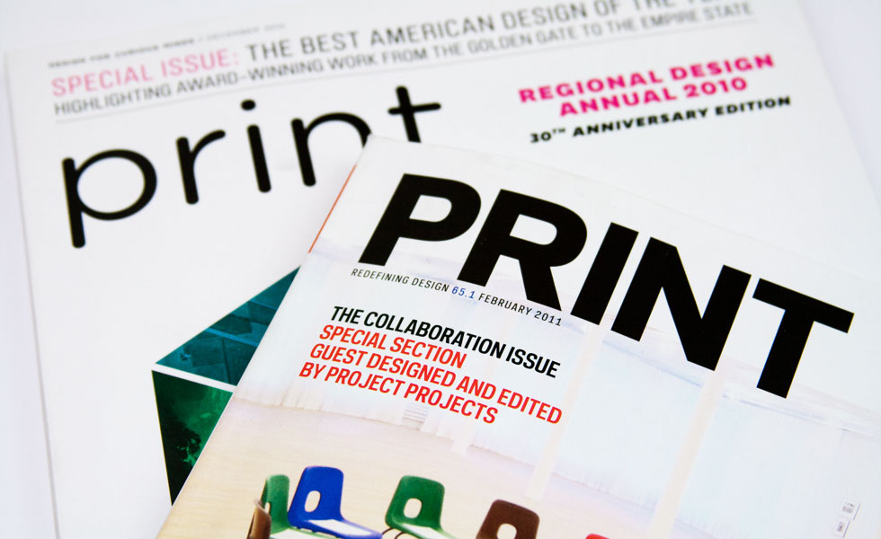
Anyone hear that sound? It’s a giant turd being dropped into your mailbox.
Actually, it’s the February issue of Print magazine.
I know what you’re saying: Does anyone still subscribe to that?
Well, what can I say? I still read it. Maybe I’m an extreme hoarder, or I don’t like to let go. Maybe I just really like 1/4 inch printed thumbnails of websites?
If you are a subscriber, you’ll notice that this month’s Print looks different. There is even a new tagline: Redefining Design (does that really mean anything?). If this issue is an indication of design’s new redefinition, we are in for some boring, inept design.
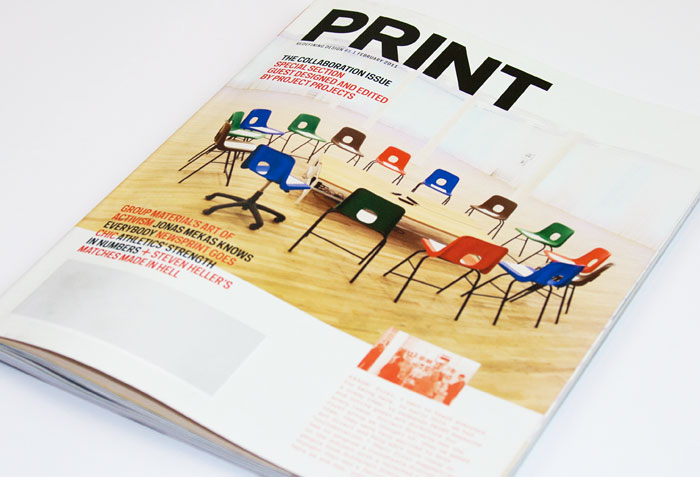
Seriously, could this cover be any more dull? It looks like an unattended support group. The room is cold and boring, even the chairs look uncomfortable. I wouldn't show up either.
Let me make a disclosure. I’ve known about this redesign for a long time now. It was about a year ago that some friends of mine began to drop hints that this was coming. With a new editor and now a new art director (Tonya Douraghy, a recent graduate of Steven Heller’s SVA program), the magazine was prepped to take a bold perspective.
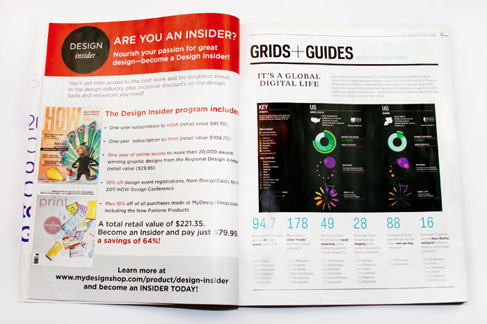
I was curious and hopeful. Print was stale. It was pretty, but safe. For a while, the minimalism could be justified, on the rationale that clean design was staying out of the way to let the work shine. But then you realize that Print barely showcases work in an impactful way either. It’s mostly a lot of whitespace, with clean, minimal typography, and small, uninspired images of the work they choose to talk about.
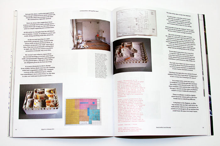
If you happen to pick up the latest issue of Print, be sure to check out the six pages of centered text starting on page 57. With no pull quotes, subheads, or captions—you’d better not try to flip through that section. Granted, this is one of the guest art-directed sections of the magazine.
Every month a new creative team guides the design for the features. This is an interesting idea, handled oddly. One would assume this art direction is limited and the magazine still has a consistent style. Not so: the grid, typography and even the paper choice change.
New editor Aaron Kenedi describes the redesign process as follows:
…an audacious, boozy brainstorming free-for all. But the next day everything still seemed like a good idea. So what you’re holding in your hands is the culmination of a mile-high bender and a handful of giddy editors and designers throwing their wish list against a wall. Only this time, it all stuck.
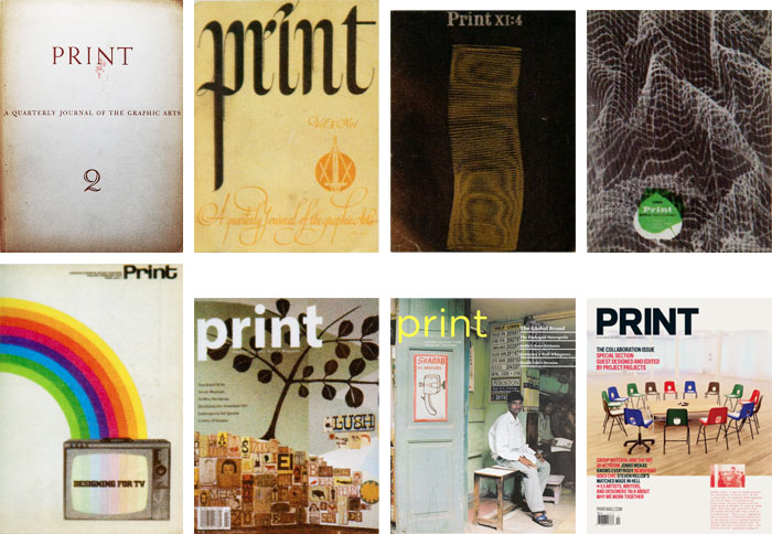
For the first time in its 70 year history, the Print masthead is composed of an uppercase sans-serif. The typefaces do provide a lot of flexibility and a new interest. Relying completely on the Galaxie family, created by Chester Jenkins and Kris Sowersby for Village, the magazine gets a well deserved facelift (inside and out), but the typography is rarely allowed to be expressive.
Print, I have no idea why I thought you’d change. You are still totally boring, but now you’re also sloppy. They kept saying you were dead and now I see why. I’m sure you sensed this coming, judging by your perfectly-timed goodbye note:
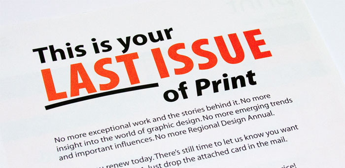
I harbor no ill will for the designers that work on Print. I know a lot of them to be talented designers in other ventures. They work insane hours and their hands are likely bound by the corporate powers that be. Print is owned by F+W Media, the proud publishers of Turkey & Turkey Hunting, Gun Digest, and Old Cars Weekly. I can see that being a tough crowd to try and convince to do awesome, unusual things. Also our industry is small and well-connected online, leaving less demand for industry magazines.
With the death of I.D. (also published by F+W) and others, Print is one of the few benchmark North American design publications left. At this crucial stage we need to ensure that it is relevant to young designers, pushes us from complacency, and challenges us, otherwise Print won’t survive either.
Rants can be hard to hear, but tough criticism keeps us honest.
Filed under: design
Comments