Award-winning print design from Cannes Lions 2009
Comments: +
July 8 2009
In a follow-up to yesterday’s post on award-winning identities at the 56th annual Cannes Lions festival, we have selected some of the most interesting print-related winners in the design category.
Never Forget a Face, Bronze
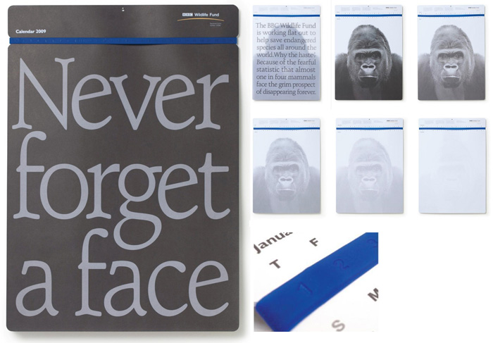
“Never Forget a Face” is a wall calendar designed for the BBC Wildlife Fund by The Chase.
2009 has been declared as The Year of the Gorilla. However there are as little as 720 mountain gorillas surviving in the wild today...
The calendar confronts people with the haunting statement to never forget our distant cousins and is supported with the graphic image of a human-looking portrait fading with the passing months, to a final ghostly picture. The calendar is loosely bound together with an ever-lasting silicon band that perfectly correlates with each date, of each month throughout the year.
Rain Changes Everything, Bronze
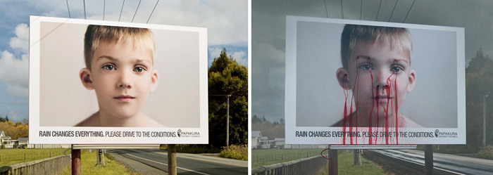
A billboard which bleeds when it rains, created for Papakura, New Zealand's road safety campaign by Colenso BBDO.
The first heavy rains after summer bring the highest death toll on New Zealand roads. To alert people to the dangers of driving in the wet, we created billboards that bleed everytime it rained. This year in Papakura, there were no deaths during the easter period.
To see the billboard in action, check out the video.
Roland Semprie Personal Trainer, Bronze
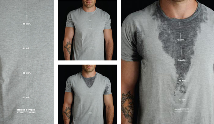
Self-promotional T-shirt for Canadian Personal Trainer Roland Semprie by GJP Advertising.
A shirt that gauges how long you've trained by the amount you sweat. Not only was this a motivator for Roland's clients, it also let Roland know if his clients were truly getting a full workout.
WWF Stationary, Bronze
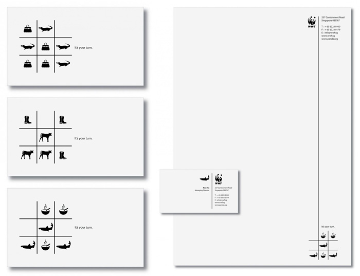
Office stationary for WWF Singapore by JWT.
In the fight to save the environment, even something as simple as office stationary can become a powerful tool. We used three intriguing executions of a popular game as part of WWF's stationary to remind us that it's all about making the right choice.
Silver Hills Bakery, Bronze
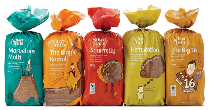
Packaging design for Canadian bakery Silver Hills by DDB.
Silver Hills had lost differentiation in an overcrowded, mundane bread section... A new series of eclectic names, whimsical illustations and witty copy help to establish ba friendly and engaging brand personality, while bold, matte ink bags provide an eye-catching shelf presence.
Designing Naturally, Bronze
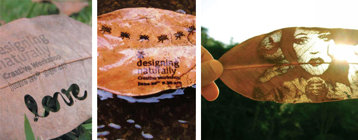
A flyer for a workshop printed on leaves by Tatil Design in Brazil.
Simple, different, meant to be looked at against sunlight—our invitation became a new medium. A flyer that is actually supposed to be thrown away on the ground. Paint free, borrowed from nature for a purpose and then returned to it.
Let's Start Collection, Silver
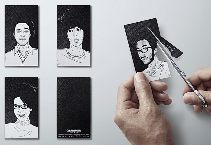
Business cards for Glammer Education Institute of Hair Design by Y&R Thailand. The card allows for shapes to be cut out with scissors, creating unique hair styles.
Let’s Start collection comes from the idea of study at Glammer Education which everyone can enjoy the study at the beginning level.
Every Image Has a Sound, Silver
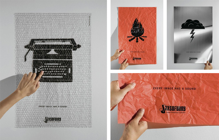
A series of posters for Saxsofunny, a sound production company in Brazil, by DDB.
The posters were printed in differeniated interactive materials, which played the sounds of the image printed on each one of them. It was an innovative way to advertise the services offered by a sound production company, with each poster providing different sensorial (visual, tactile and auditory) experiences.
Broken Window, Silver
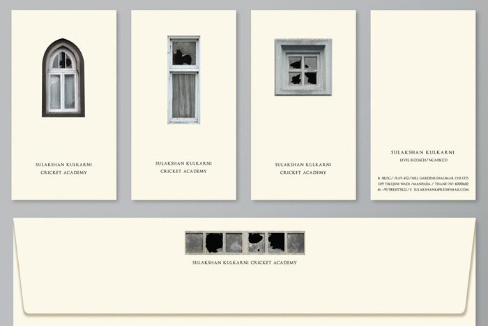
Stationary and business cards for India-based cricket academy by Red Lion Publicis.
The symbols of India's love for cricket were all around us, in window panes broken by a stray ball from children playing in the street. We decided to use them as elements in our graphic identity... It also resulted in a lot of smiles, nostalgic conversations and a 20% increase in inquiries...
Alpina Wall Calendar, Gold
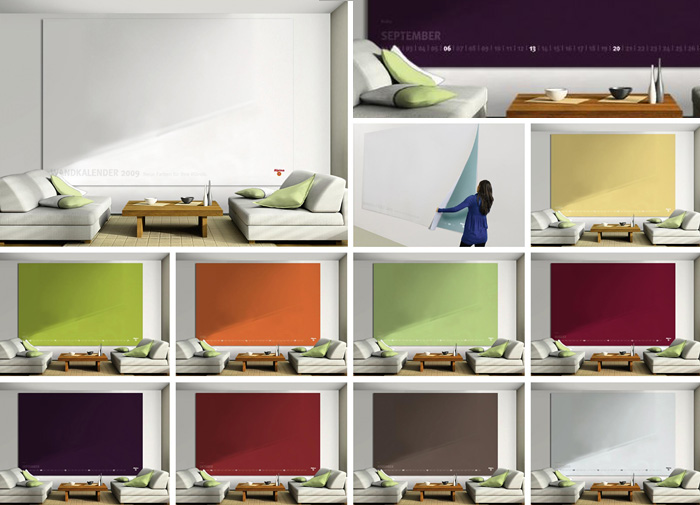
World's biggest indoor tear-off calendar for Alpina Paint by Scholz & Friends Group in Germany.
Every month a new, trendy Alpina paint color can be seen on a 3m x 2m calendar page to promote the ‘Color of the Month’. In this way you can see before how great a newly-painted wall would look.
Piglet, Gold
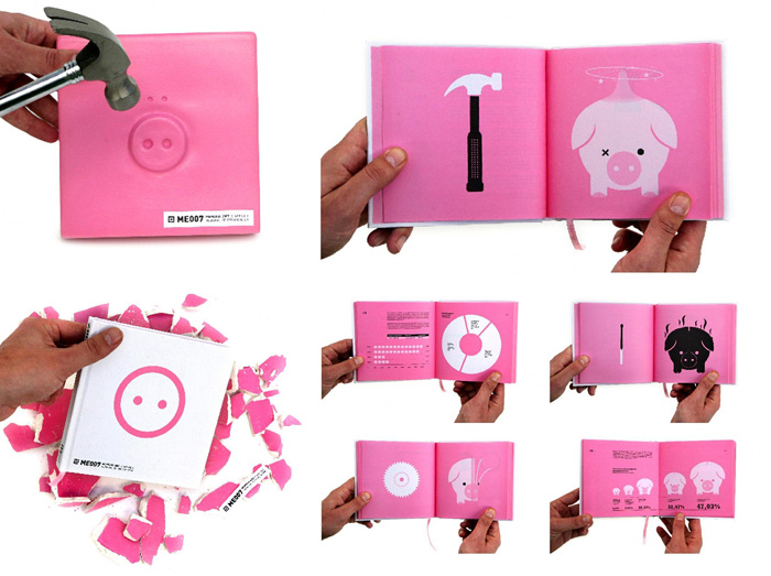
An annual report created for the treasury office of Murcia, Spain. Designed by F33, the book was enclosed in a breakable “piggy bank”.
The challenge was to create an attractive book that deals with numerous charts, graphs and technical information all related to one issue, money... We created our very own piggy bank, where the book was concealed inside. Our audience had to break open the piggy bank to see the book...
Havaianas, Gold
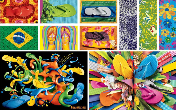
Campaigns for Havaianas Sandals by AlmapBBDO.
...by reflecting Brazil's easygoing personality, its soul and culture, we're building a unique identity. Transforming a simple rubber sandal into the first truly Brazilian global brand.
Jme, Gold
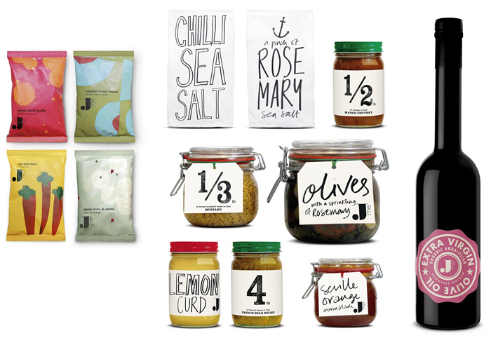
Packaging for Jamie Oliver's lifestyle brand Jme by UK's Pearlfisher.
The packaging for this eclectic lifestyle range is fresh, striking and considered, reflecting the function of each product, and using the bold Jme logo to hold the collection together. It also uses imaginative and environmentally responsible packaging solutions. Jme larder products reference artisan traditions of market stall markers and handwritten labels.
Cheaper Than Paper, Gold
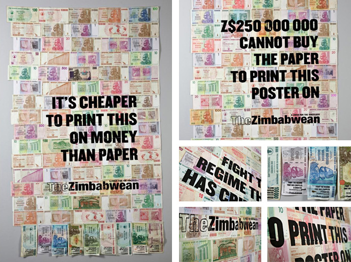
“Trillion Dollar Posters” sets a strong message by using money as the medium for a series of posters for The Zimbabwean newspaper by TBWA\HUNT\LASCARIS.
Having been driven into exile and saddled with a massive duty, our client had a limited budget but a need for their message to break through the reams and reams of coverage on Zimbabwe.
One of the most eloquent symbols of Zimbabwe’s collapse is the Z$ trillion dollar note, a symptom of their world record inflation. This money cannot buy anything, not a loaf of bread and certainly not any advertising. But it can become the advertising. So, we turned the money into its own medium by printing our messages straight onto it. By sticking notes together we created posters and then we silk-screened our message straight onto the money.
Onion Calendar, Gold
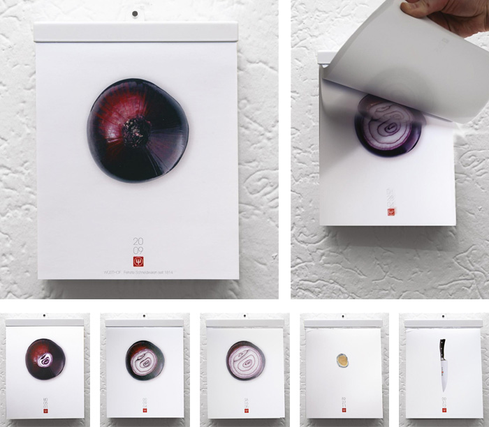
A daily tear-off calendar for Wüsthof knives by Serviceplan in Germany.
We thought about the most common thing which is cut in kitchens all over the world. The answer was: onions. After that, the question came: is it possible to cut an onion into 365 slices? A little slice for everyday? Of course it was. With sharp-edged knifes from Wüsthof. So we cut one onion into 365 slices.
Paper Battlefield, Grand Prix
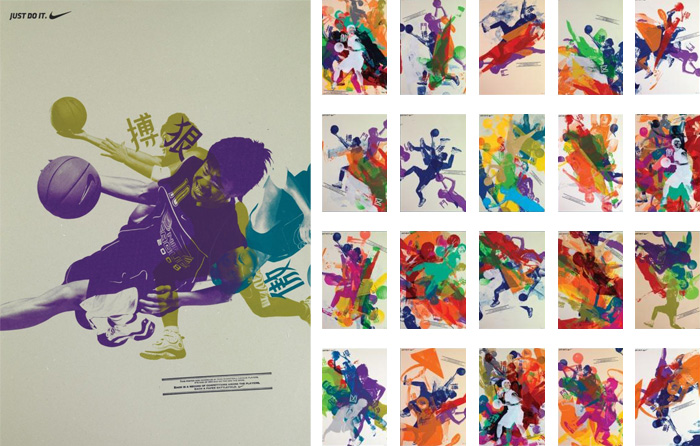
Winning the top Design Lions award, McCann Worldgroup created a unique series of posters for the annual Nike Basketball League Competition in Hong Kong.
We have literally translated the spirit of competition onto the posters. 350 posters were handmade by the players. Images of the top 10 players, each representing a unique skill were turned into printing templates. Then they were invited to a silkscreen workshop to print their image on top of each other. The posters became their battlefield. The random cross-printing became their battles. And the printing process became our message.
For more, check out our post on the winning identity projects, and also check out the packaging winners compiled by our friends at TheDieline. You can see the full list of award-winners at the Cannes Lions website.
Filed under: design
Comments