Comments: +
July 19 2011
")
There has been an explosion of interest in infographics. Lowly excel-charts have been overshadowed by the unexpected visualizations being circulated lately. Though information design has a rich history, magazines like GOOD, Wired, and Popular Science have helped to repopularize data visualization in recent years and created a cultural interest in the data behind the headlines.
Designer Nicholas Felton elevated infographics to a personal art-form with his immaculate annual reports. Felton himself was recently hired by Facebook, implying the social media giant has more than a passing interest in data visualization too. Other designers and agencies have taken note of the trend. From Scott Stowell to Pentagram’s former partner Lisa Strausfeld (who left the firm this past March to focus more time on data visualization), designers have done stunning work that helps educate people in new ways.
Filed under: infographics
Comments: +
August 5 2009
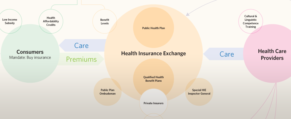
US health care reform is a complicated issue which seems nobody can agree on (or even fully understand). In an attempt to make sense of it, California-based designer Robert Palmer eases the pain with a new infographic.
Political chart wars—it began in mid-July when Republication John Boehner released an organizational chart of the House Democrats’ health plan. It was intentionally obfuscating (“Scaring America with badly designed health care infographics,” as GOOD puts it), turning a complicated issue into a visual nightmare. With an emotional response entitled “Do not f**k with graphic designers,” Robert Palmer redesigns the controversial chart.
Filed under: infographics
Comments: +
July 17 2009

Do you know where your food comes from? “It’s Time for Real” is an animated spot for a new campaign out of Canada urging people to “Eat Real, Eat Local.”
Created by Crush and directed by Steve Gordon, the goal was to create something “part table top, part graphics and part documentary.” The spot makes use of animated infographics cleverly overlaid on a ‘typical’ family dinner to make a point about the effects of food importation on everything from the economy to the environment. As Information Aesthetics points outs, while the message is targeted for Canadians, it certainly applies universally.
Filed under: infographics
Comments: +
June 24 2009
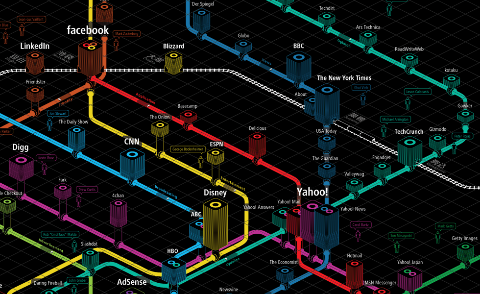
Using Tokyo Metro as a guide, Information Architects maps the world's most influential websites as a virtual subway system.
Information Architects (iA) recently published Web Trend Map 4, the latest version of their popular web diagram. The diagram references a selection of the top 333 websites based on traffic, revenue, age, ownership, and character.
Filed under: infographics