Gap turns to crowdsourcing (or not)
Comments: +
October 7 2010
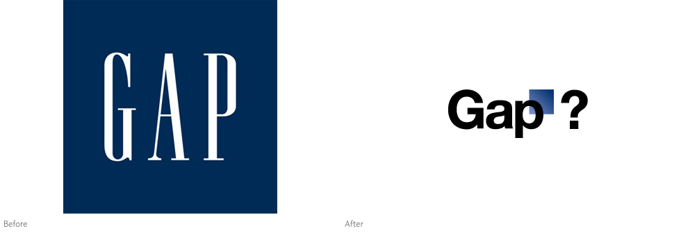
One of America’s most recognizable clothing brands launches a new logo—or not.
After quietly posting a new logo on Gap.com earlier this week, the online community was to quick to respond with overwhelmingly negative feedback. After all, Gap has built a solid brand since its humble beginnings in 1969 as a Levi’s and record store. So why trade that for Helvetica (and an awkwardly placed square)?
Among the outcry (including a Twitter parody), Ogilvy partner Diego Zambrano went as far as offering a free redesign. Many other designers offered their own suggestions via Dribbble as well.
As it turns out, that’s exactly what Gap is asking for.
Having been quiet until now, Gap finally responded to the criticism via Facebook late Wednesday:
Thanks for everyone’s input on the new logo! We’ve had the same logo for 20+ years, and this is just one of the things we’re changing. We know this logo created a lot of buzz and we’re thrilled to see passionate debates unfolding! So much so we’re asking you to share your designs. We love our version, but we’d like to see other ideas. Stay tuned for details in the next few days on this crowd sourcing project.
Crowdsourcing project!?
At the time of writing, Gap’s Facebook post had nearly 250 comments. It makes me wonder, is this all a publicity stunt or is the company seriously this out of touch?
It has been reported the new logo was designed by New York-based Laird and Partners, who have worked previously with Gap’s advertising. idsgn contacted both Laird + Partners and Gap’s public relations department for further comment, but our calls were not immediately returned.
Video: A brief history of the Gap brand
UPDATE: Marka Hansen, president of Gap North America, provides some further information on Huffington Post (Oct 7, 2010):
We chose this design as it's more contemporary and current. It honors our heritage through the blue box while still taking it forward.
Now, given the passionate outpouring from customers that followed, we've decided to engage in the dialogue, take their feedback on board and work together as we move ahead and evolve to the next phase of Gap.
From this online dialogue, it's clear that Gap still has a close connection to our customers, so tapping into this energy is right. We've posted a message on the Gap Facebook Page that says we plan to ask people to share their designs with us as well. We welcome the participation we've seen so far.
We'll explain specifics on how everyone can share designs in a few days…
Co.Design talks to Bill Chandler, vice president of corporate communications (Oct 7, 2010):
The new logo was designed by Trey Laird and his firm Laird and Partners, who have served as Gap's creative directors for many years, while working closely with Gap of North America president Marka Hansen. While Chandler stresses that Gap stands by the logo they've created, they also want it to signify that the company itself is changing—and that should come with input from consumers…
The new logo will be featured in the holiday advertising campaign, he says, and be part of a larger 2011 rebranding. ‘But before the launch goes any further we're going to see what other ideas are out there…’
Specifics about the crowdsourcing contest will be released in a few days, he says. ‘We're going to establish a process,’ says Chandler…
Meanwhile, logo redesign contests on ISO50 and 99designs have gained over 1,300 user-submitted entries combined. Websites like Gapify and Crap Logo Yourself have also popped up, allowing you to make your own logo spin-off.
…I should let you know that I’ve also frequently shopped at your stores. You sell good stuff. But never in my experience has any of your employees offered me a free pair of pants because the ones I was wearing looked bad. I wouldn’t expect them to. Their job is to sell me clothes.
My job is to sell design.
AIGA president Debbie Millman also weighs in, reporting that the AIGA has written to the company’s senior executives and public relations team (Oct 8, 2010):
We did not…just send the anti-spec treatise. We would like to give them the opportunity to have a considered discussion as opposed a public one-sided bashing.
That being said, I have made my personal point of view very clear: I firmly believe that crowd-sourcing and spec work is about designers giving their work away for free. But it is also about an abuse of power. The ‘client’ has it all. The designer has none. Unless, of course, we say no.
Gap executives say an official crowdsourcing contest will be released in a few days. This isn’t looking good.
UPDATE: It’s official, Gap has decided to scrap the new logo, bringing back classic ‘blue box’ across all channels. A press release posted on gapinc.com today states the crowdsourcing contest has also been cancelled (Oct. 11, 2010):
Last week, we moved to address the feedback and began exploring how we could tap into all of the passion. Ultimately, we’ve learned just how much energy there is around our brand. All roads were leading us back to the blue box, so we’ve made the decision not to use the new logo on gap.com any further…
We’ve learned a lot in this process. And we are clear that we did not go about this in the right way. We recognize that we missed the opportunity to engage with the online community. This wasn’t the right project at the right time for crowd sourcing.—Marka Hansen, president of Gap brand North America
At the time of writing, gap.com still shows Laird and Partners’ short-lived Helvetica logo, however a Facebook post confirms “we’re bringing back the Blue Box tonight.”
Despite the logo failure, Ad Age reports Gap’s relationship with Laird and Partners will continue. "We are still engaged," says Gap representative Louise Callagy.
Filed under: branding
Comments