Know your type: Gotham
Comments: +
July 22 2009
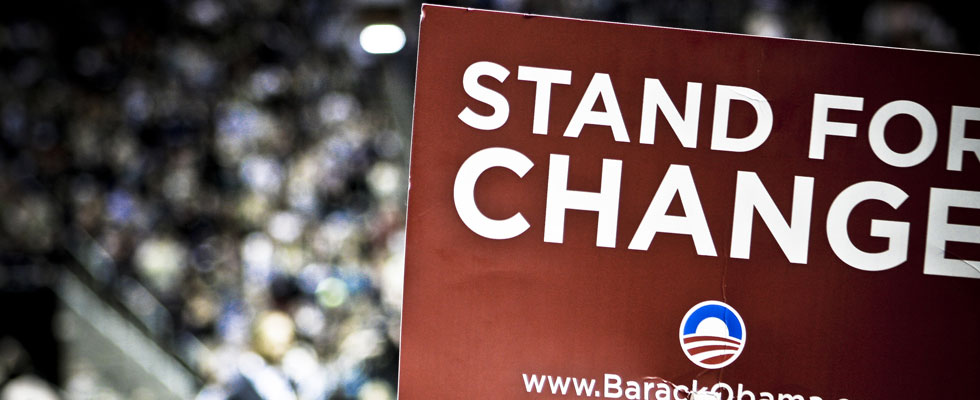
Perhaps most well known from the successful Obama ’08 presidential campaign, Hoefler & Frere-Jones’ Gotham has been referred to as the typeface of the decade—and it’s the subject of the fourth installment in our ‘Know your type’ series.
Masculine, new, and fresh
Gotham was born in 2000, when men’s fashion magazine GQ commissioned New York-based Hoefler & Frere-Jones to create a new typeface for use in their publication. Provided with a brief to create something “masculine, new, and fresh,” type designer Tobias Frere-Jones drew influences from post-war building signage and hand-painted letters seen around New York City. Using the seemingly plain, geometric lettering from New York’s Port Authority Bus Terminal as the project’s touchstone, an American “working class” typeface was born.
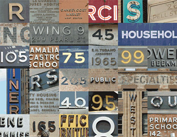
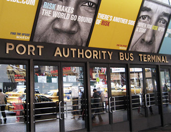
We [Tobias Frere-Jones and Jonathan Hoefler] both grew up in the city and independently we've walked around the streets and earmarked pieces of lettering or signage that we thought would be a good seed, or starting point for a project somewhere down the line. And we both noticed the letting on the Port Authority Bus Terminal up on 42nd Street and 8th Avenue. The lettering over the front door is this very plain geometric letter, but its not the type of letter that a type designer would make. It's the kind of letter an engineer would make. It was born outside of type design, in some other world and has a very distinct flavor from that.
-Tobias Frere-Jones, from a Helvetica film outtake
In drawing Gotham, Frere-Jones used the “mathematical reasoning of a draftsman” (over his instincts as type designer) allowing the letters to escape the grid wherever necessary. This process gave the design a unique quality often missing from geometric faces, while its vintage New York sources distinguish it as a notably American typeface. As put by Newsweek, “Unlike other sans serif typefaces, it's not German, it's not French, it's not Swiss. It's very American.”
Interestingly, Frere-Jones admits Gotham may never had happened without the GQ commission: “The humanist and the geometric… had already been thoroughly staked out and developed by past designers. I didn't think anything new could have been found there, but luckily for me (and the client), I was mistaken.”
From Bus Terminal to Campaign Trail
In 2002, GQ’s exclusive license had expired and the typeface was released publicly. Spreading rapidly, it has been used in newspapers, corporate logos, movie posters, and packaging for brands like Coca-Cola, Netflix, Crest, and countless others.
Perhaps due to its bold ‘American’ feel, the 2008 U.S. presidential elections were particularly good for Gotham. First used by the short-lived John Edwards campaign, it was Barack Obama's successful run that made the font more popular than ever.
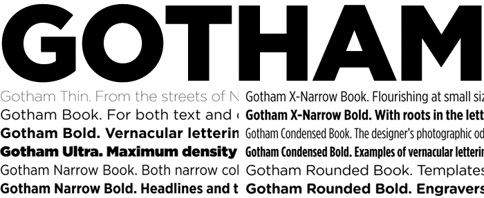
A well-rounded family
Due to its popularity, a Rounded variant was created in 2005—again the result of a commission, this time from the graphic design magazine Print. In 2007, after Print’s exclusivity had passed, the font became available to the general public. Earlier this year Narrow and Extra Narrow variations were introduced, creating a total of 66 Gotham styles.
Usage
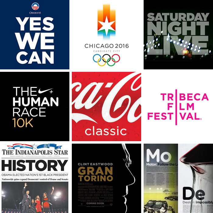
While USA Today has called Gotham the font of the decade, it certainly has proven to be a typeface we can believe in.
Also see:
Filed under: typography
Comments