And the gold goes to…
Comments: +
August 14 2009
Last week we asked readers to vote on their favorite candidate logo for the 2016 Summer Olympics. We have the results—and we also take a look at how the winning logo might evolve.
Our readers have spoken, with Madrid coming out on top (receiving 48% of the votes) and Chicago coming in second (with 27%). We'll have to wait until October to find out what the Olympic Committee decides, and (as a couple commenters pointed out) the final logo may change drastically.
Today we take a look at the identities of the Games over the past decade to see how they have evolved from the bid process into the official mark seen around the world.
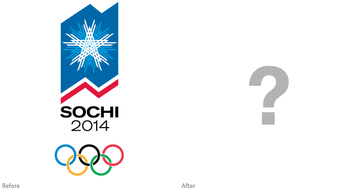
Sochi, Russia · 2014 Winter Olympics
Sochi's official logo is scheduled to be announced mid-2009 (…so, any day now).
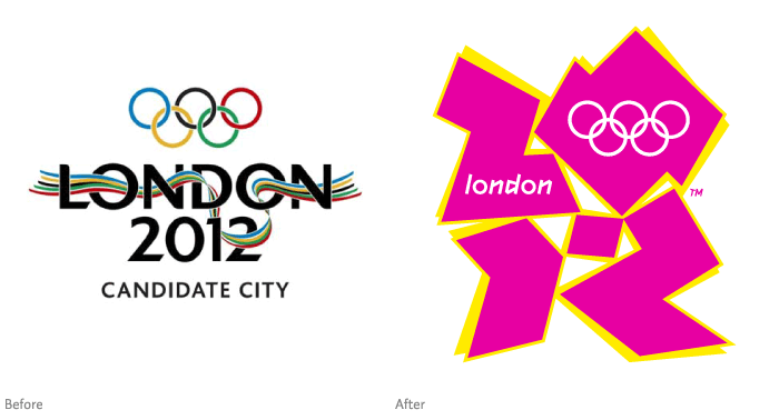
London, England · 2012 Summer Olympics
Before the controversial, seizure-inducing identity (designed by Wolff Olins) was unveiled in June 2007, London won over the Olympic Committee with a much simpler logo (similar to Tokyo's 2016 bid logo) designed by Kino Design.
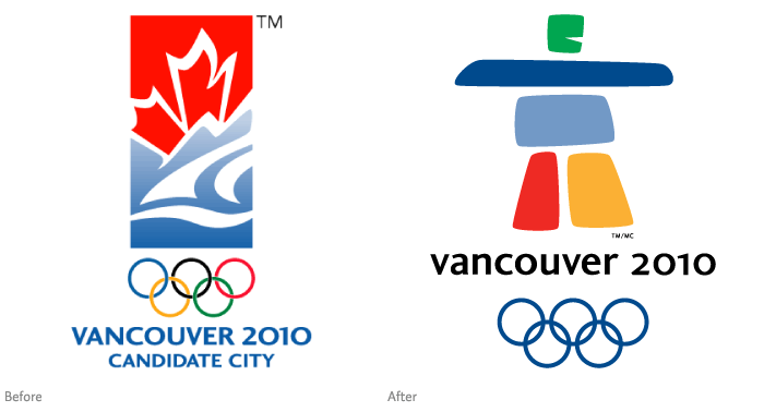
Vancouver, Canada · 2010 Winter Games
I'm not sure what Vancouver was thinking with their bid logo, but luckily a new design was chosen for the official logo. Designed by Elena Rivera MacGregor and Gonzalo Alatorre, the logo was selected from over 1,600 submissions in a contest, and features a traditional stone sculpture used by Canada's Inuit people.
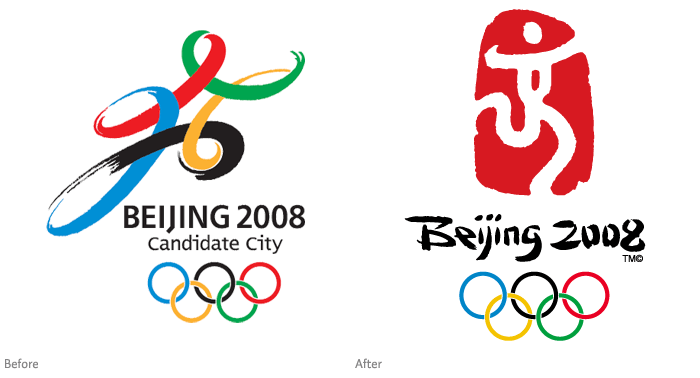
Beijing, China · 2008 Summer Olympics
“Dancing Beijing” (as the logo is officially referred to) draws on various elements of the country's culture, featuring a single Chinese character in a traditional red seal. It was created by Guo Chunning and chosen among 1,300 entries.
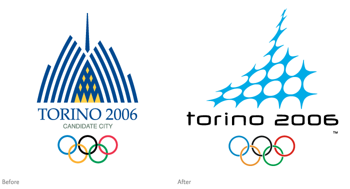
Turin, Italy · 2006 Winter Olympics
Designed by Studio Husmann-Benincasa, the Torino logo goes from classic to high-tech with a snowflake in the shape of the city's famous landmark, the Mole Antonelliana.
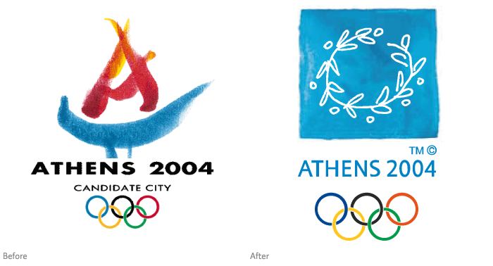
Athens, Greece · 2004 Summer Olympics
Replacing a stylized torch, the final Athens logo features a wreath made from an olive tree branch, a reference to the official award of the ancient Olympic Games.
Filed under: branding
Comments