Comments: +
April 20 2012
")
The creative community loses a multi-talented inspiration.
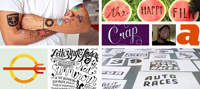
Designer, author, and filmmaker Hillman Curtis sadly passed away on April 18th after a three year battle with cancer. At only 51, Curtis leaves behind an impressive body of work which includes numerous award-winning short films and the feature-length film Ride, Rise, Road about David Byrne and Brian Eno.
Curtis is perhaps best known for his popular Artist Series, which was ongoing from 2005 and featured designers like Milton Glaser, Paula Scher, and David Carson.
His latest project, The Happy Film, is a feature-length film loosely based on designer Stefan Sagmeister’s book Things I Have Learned in My Life So Far. It was in production at the time of his death.
Filed under: design
Comments: +
February 10 2012

Are unpaid internships evil, or is education payment enough? Thomas Wilder reflects on his past experience as an unpaid intern at a New York design firm.
Editor’s note: idsgn spans different points of view, and what follows is an opinion not neccesarily shared among our editorial team. However, we feel the debate is a valid one to explore and the topic is worthy of further discussion.
During my years in design school, I worked on countless projects with professors and never expected anything in return other than their vast knowledge. I understood it would help me in my future profession.
Following my junior year, I obtained an unpaid internship at a design firm in New York City. There, I was taught by an extremely talented creative director who mentored and educated me about the professional side of design. My professors were extremely talented and unusually nurturing, but I came to understand the knowledge gained during an internship can be invaluable, and the experience can shape the way one approaches, visualizes, conceptualizes and executes a design project.
Filed under: design
Comments: +
January 27 2012
Wrapping up our Fresh & Hungry series, Chris Rubino speaks with London-based Sean Freeman.
CHRIS RUBINO: I think your work is probably the most developed of the winners this year, it’s quite impressive that you are still under 30. How early on did you realize such a strong vision for your work? How did typography become the voice for that vision?
SEAN FREEMAN: Thanks! I don't think a strong vision for my work came consciously, more that over the years of experimentation it’s become tighter and I feel I know more now about where I want my work to be and at what level.
I've always been very into illustrated type and have a particular love for words so I enjoyed combining that love for words with being naturally curious.
Filed under: design
Comments: +
January 26 2012
Chris Rubino speaks with Brooklyn-based photographer Elizabeth Weinberg, our next Fresh & Hungry subject.
CHRIS RUBINO: Recently I'm finding it difficult to select photography I really respond to. Maybe its just being overwhelmed, I don't know, but I really like that you have such a cohesive body of work. Do you think about your voice as a photographer? What do you look for when creating an image?
ELIZABETH WEINBERG: I don't really put too much thought into it, honestly. It's just what I do. I've found that if I start over-thinking photography I get really burnt out on it and lose the pure love for it that I always want to have. I let my instinct guide me and if I want to take a picture, I take it. Simple as that, and I don't think it has to be any more complicated.
Filed under: design
Comments: +
January 25 2012
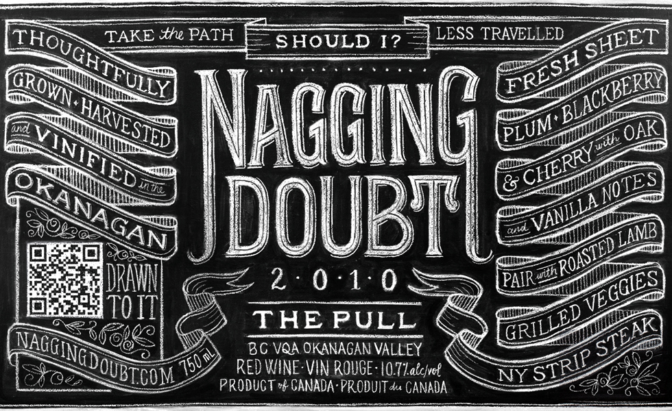
In this Fresh & Hungry, Chris Rubino talks with Dana Tanamachi, a graphic designer and custom chalk letterer living in Brooklyn.
CHRIS RUBINO: Your work is so striking, I love that you’ve chosen such a unique and tangible medium. I’m sure you’ve been asked this a lot but how did the chalkboard drawings begin? That decision has truly created a voice that you can call your own.
DANA TANAMACHI: Thank you! I never tire of telling this story because it's an occasion to boast about my incredible community of friends here in Brooklyn. A couple years back, there was a Great Gatsby-themed housewarming party in Boerum Hill—and of course everyone came all gussied up. My friends' new place had a huge chalk wall in their living room, and a much smaller one to the side. She suggested that I pick up a piece of chalk and doodle something ("You're artsy, aren't you?"). So I did. My other friend and I wrote the word Brooklyn on the wall—it was relatively small; not amazing. But people started coming over to it and commenting how great it was. Soon it became the "photo wall" for the party and all the photos were uploaded to Facebook after that night. I guess we were on to something.
Filed under: design
Comments: +
January 24 2012
Continuing our Fresh & Hungry series, Chris Rubino chats with Brooklyn design trio GrandArmy—Larry Pipitone, Joey Ellis, and Eric Collins.
CHRIS RUBINO: I'm very interested in the group dynamic GrandArmy has. I think it really brings an eclectic quality to your work. How important is this collaborative process to your work? And how did this become the way each of you decided to work?
GRANDARMY: The collective nature of GrandArmy has been indispensable in creating our body of work. Before working together we had all developed similar tastes as creative people, and this was one of the reasons we initially decided to join forces. Looking back over the GrandArmy portfolio in its entirety, it is hard to find a single piece that wasn't at some point impacted by each member's distinct fingerprint.
Filed under: design
Comments: +
January 23 2012
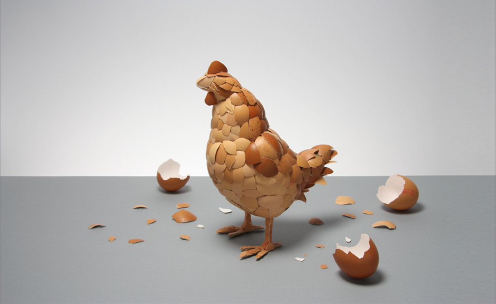
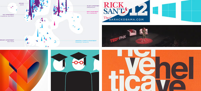
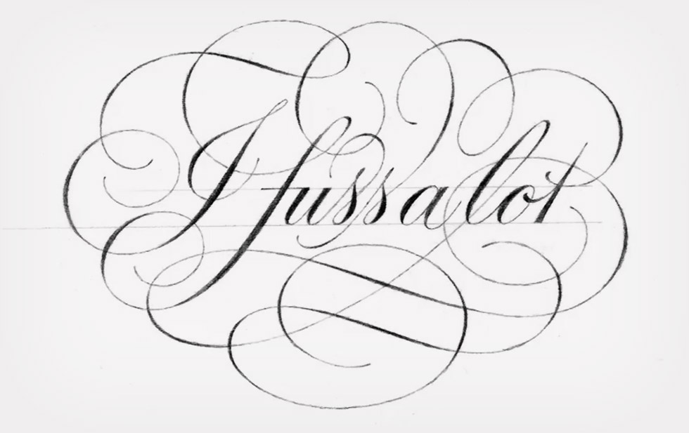
Kicking off our Fresh & Hungry series, Chris Rubino speaks with ADC Young Gun recipient Kyle Bean.
CHRIS RUBINO: I’m going to assume you have the most exciting studio of any of this year’s Young Guns. I’m very impressed with your appropriation of materials and impeccable craftsmanship. Can you talk a bit about your various approaches to each individual project and how materials are chosen? Do you have a pile of materials on reserve for the future?
KYLE BEAN: It may come as a surprise but my studio is actually pretty small, and as such I have to try and keep it fairly clutter free! I have a cutting desk, a plan chest to store all of my sheet material, a book case and a few storage boxes full of other materials. I go through phases of hoarding materials, and I have often kept things for years thinking that one day they might be useful, but eventually I have to let them go! I like using everyday materials the most, as they are obviously easily accessible but also have an immediacy or familiarity to them - So that when people look at the images/objects that I create I hope that they can understand what the material is that I have used to create them. I get a lot of pleasure from constructing objects and images from humdrum things. There is something very satisfying about reforming a cardboard box, or even pencil shavings (as in my Pencil Shaving Portraits for Wallpaper* magazine) into something new and unexpected.
Filed under: design
Comments: +
January 23 2012
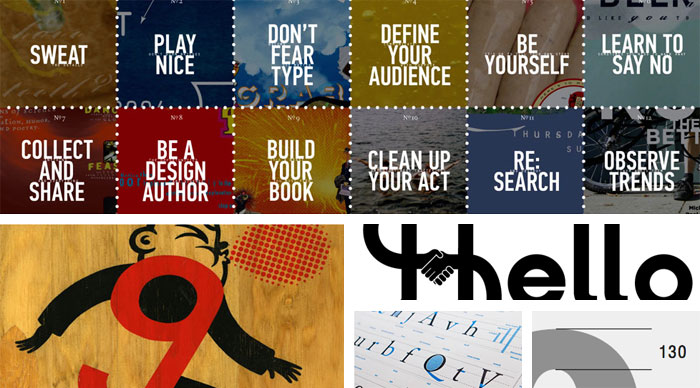
The world of design is expanding so quickly. I truly believe in the past 10 years it has grown in size and talent like never in the past.
The ADC Young Guns continue to be on the forefront of this evolution. Just take a look at the latest winners, such a diverse collection of talent. Designers using traditional skills in new ways, designers with very unique voices, many working at levels well beyond their years. As always it is difficult to select just a few from this very talented class but I’ve chosen 5 of my favorites to find out a bit more about where they are coming from and where they are going.
Filed under: design
Comments: +
January 6 2012
With 2012 upon us, we look back over our most memorable articles of last year.
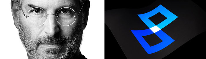
Steve Jobs, 1955-2011
We wrote about Steve Jobs’ impact on design and his collaboration with design legend Paul Rand on the NeXT brand. Little did we know he would pass away a few short days later at the age of 56.
9/11 ten years later
2011 marked the ten year anniversary of the September 11 attacks. On this day, we took at look at one design firm’s approach to commemorate the events of 9/11.
Filed under: design
Comments: +
December 11 2011
It’s that time of the year again, and we’re back with twelve must-have design gifts for the holidays.
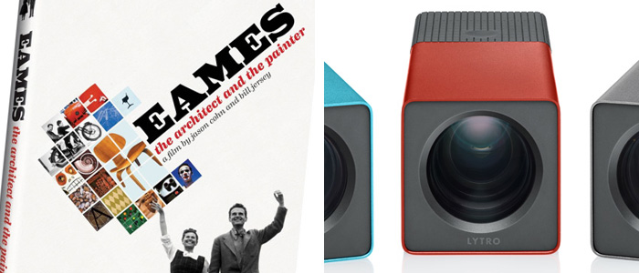
12 inspiring moments
You’re bound to find at least a dozen inspiring moments in this documentary on modern design legends Charles and Ray Eames. Snag the DVD when it hits stores December 13th, just in time for the holidays.
11 million light rays
The first of its kind, the Lytro Light Field camera lets you play with light and capture “living pictures.” Thanks to its light field sensor that captures 11 million light rays, you can shoot now and focus later.
$399 - 499 from Lytro
Filed under: design
Comments: +
October 11 2011

Brand Thinking and Other Noble Pursuits is the latest book from Debbie Millman. In this ‘Design discussions,’ we speak with the author about the book, her time as president of the AIGA, and her thoughts on the most important aspects of creating a brand.
The name Debbie Millman should be familiar to most idsgn readers. Former president of the AIGA, Millman hosts a weekly online talk show called Design Matters and is the author of several design books, including How to Think Like a Great Graphic Designer. She is also a contributing editor at Print Magazine, chair of the Masters in Branding program at the School of Visual Arts in New York, and president of the design division at Sterling Brands. And I could go on and on.
Filed under: branding
Comments: +
September 26 2011

Steve Jobs’ recent departure from Apple was met with sadness and nostalgia within the design community. And rightly so. Jobs had a unique appreciation for the value of design and allowed designers to flourish in a way that is rarely seen in business.
This mutual respect led to some of the most beautiful industrial design and revolutionary products in human history. Talented designers like Jonathan Ive and others, serendipitously met one of the most visionary CEOs in history. This allowed designers to create products, experiences, and interactions based on what was important to the people using them. It doesn’t seem revolutionary, but the trust and freedom offered by Apple stands apart in a world where designers are often forced to base their designs on what is important to a committee and to the fearful levels of corporate structure.
Filed under: branding
Comments: +
September 11 2011
A decade later‚ COLLINS asks: how should we commemorate 9/11?
From commemorative pins to stars-and-stripes-clad paraphernalia, there have been many attempts to commemorate the events of September 11‚ 2001 over the past ten years.
Stepping away from overt imagery and attempting to create a symbol that can resonate on a more global scale, New York-based firm COLLINS has taken upon itself to create a new symbol to honor 9/11.
Filed under: branding
Comments: +
August 11 2011

There’s more to Jim Henson than Kermit the Frog.
Recently I had the opportunity to see Jim Henson’s Fantastic World, a new exhibit at New York’s Museum of the Moving Image. Not surprising, the exhibit is heavily Muppet focused, but it doesn't end there. The exhibit spans Henson’s entire career from early sketches to his pioneering television work.
Among the many classics, one piece really stood out to me: a short film from 1965 titled Time Piece. Produced, written, directed by, and starring Jim Henson himself, the short experimental film was very much a personal side project. Beginning in the spring of 1964, nearly ten years after the introduction of the Muppets, Henson filmed the short through weekend and late nights between commercial projects and Muppet appearances.
Filed under: motion
Comments: +
July 19 2011
")
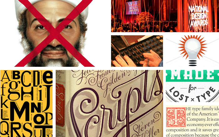
There has been an explosion of interest in infographics. Lowly excel-charts have been overshadowed by the unexpected visualizations being circulated lately. Though information design has a rich history, magazines like GOOD, Wired, and Popular Science have helped to repopularize data visualization in recent years and created a cultural interest in the data behind the headlines.
Designer Nicholas Felton elevated infographics to a personal art-form with his immaculate annual reports. Felton himself was recently hired by Facebook, implying the social media giant has more than a passing interest in data visualization too. Other designers and agencies have taken note of the trend. From Scott Stowell to Pentagram’s former partner Lisa Strausfeld (who left the firm this past March to focus more time on data visualization), designers have done stunning work that helps educate people in new ways.
Filed under: infographics
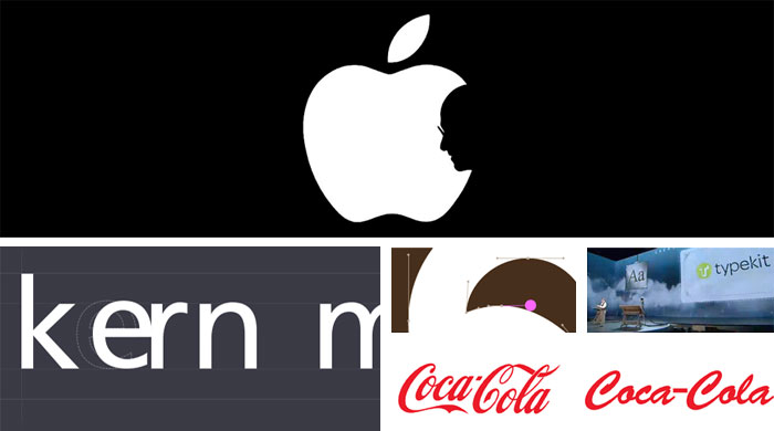
Comments: +
June 28 2011
Webfonts have arrived at idsgn… and it’s about time.
When we launched idsgn over two years ago, @font-face was still just a spec and Typekit did not yet exist. One of the few options web designers had for ‘real fonts’ (read: not Verdana) was sIFR or ‘Scalable Inman Flash Replacement.’
Around fall 2009, the web typography landscape started to change as Typekit and other webfont services started to pop up. We wrote an article on web typography around this time which outlined some of the problems and setbacks at the time (and still serves as a somewhat relevant introduction to fonts on the web).
Filed under: Announcements
Comments: +
June 14 2011
")
We’ve all seen it. It’s on posters, T-shirts, pillows, notebooks, buttons and iPhone cases.
There are multiple Tumblr blogs dedicated to its multitude of variants: “Keep Calm and Use the Force,” “Keep Calm and Carry On My Wayward Son,” “Keep Calm and Beam Me Up Scotty.”
As a designer I am visually assaulted and overwhelmed by the enormous amount of adaptations the “Keep Calm and Carry On” print has seen. However, upon searching deeper into the mystery of this culturally iconic print, there's a history filled with war, panic, and invasion.
Filed under: culture
Comments: +
June 6 2011
Introducing Newswordy, a new site from the team behind idsgn.
Buzzwords are frequently used in news media. These are words that do not typically occur in everyday speech, but are common among newscasters, talking heads, and pundits on cable news.
These ‘news words' are accepted by audiences for their implied meaning. But often loaded words are misused or used out of context. The actual definitions can be different than what is implied.
Every weekday, Newswordy will celebrate one of these words.
Filed under: Announcements
Comments: +
May 18 2011
")
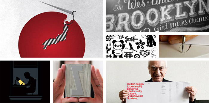
In the most unlikeliest location lies a typographer’s oasis.
Far from the intellectual boomtowns, surrounded by desert, in a dusty industrial lot, hides an oasis of ascenders, ampersands, and slab serifs.
Any type-nerds or inclined designers should first be prepared to pass through an army of Ed Hardy-shirted, barbed-wire-biceped, faux-hawk-wearing-infantry that serve as a sturdy wall of defence to this sanctuary of letters. The unruly guard preserves the secret of a place called the Neon Boneyard.
Filed under: typography
Comments: +
May 9 2011

Does it make sense to walk into a restaurant, ask the chef to make you three entrees, eat from all three plates and then skip out on the bill if you didn’t like any of the options? The answer is no.
Sometimes it feels like we, as designers, put up with this treatment. We may even invite it by not questioning this attitude or acting against it. But today, I want to focus on something even more ineffective and misguided that is threatening our industry: crowdsourcing.
Imagine our dinner analogy now extends to crowdsourcing. In the chef’s kitchen, you’re again in search of the perfect meal. But now you have a great idea! Fire the chef and invite random people from the streets (and wherever you can find them). Tell them they will not be paid a chef’s salary, but they can play with all the fancy equipment and be a chef-for-a-day (oh, and they can now put this on their résumé!).
Filed under: design
Comments: +
April 21 2011
")
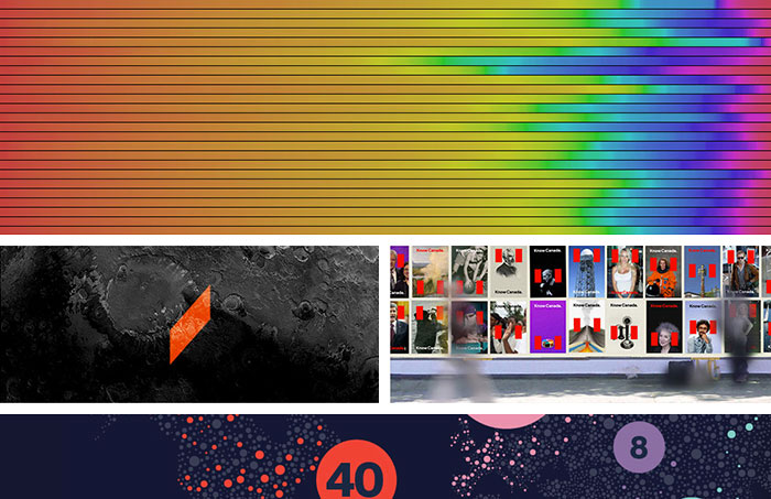
As designers, we know color is important. But when food is your medium, color can be powerful enough to influence taste—and affect health.
Say hello to Blue No. 1, Yellow No. 5, and Red No. 40.
These numbers make up part of an artificial color palette approved by the United States’ Food and Drug Administration. First introduced in 1906, the FDA’s Pure Food and Drug Act (and later the Food, Drug, and Cosmetic Act) was put in place to ensure the safety and wholesomeness of food products. Before this, more than eighty dyes were used to color food, without regulation—the same dye could be used to color both clothing and candy.
Filed under: culture
Comments: +
April 4 2011
On April 1st, we posted an article titled Sonoran: The next Helvetica. Yes, this was an April Fool’s Day joke—and yes, the actual typeface we showed was Arial. But it wasn’t all lies.
Here are some hidden truths that you may or may not have spotted:
- Arial was originally named Sonoran Sans Serif (we did not make this up), created by Monotype to compete with Helvetica.
- The typeface was, as we said, designed by Robin Nicholas and Patricia Saunders.
- It was designed in the 1980s (originally released in 1982 as Sonoran, renamed Arial in 1992).
- Helvetica was designed by Max Miedinger in 1957, of course—everything about Helvetica was true.
- Massimo Vignelli did say “Helvetica is our ultimate typeface: objective, powerful, and delicate according to weight” (the rest we made up).
- FontFont did take down their website on April 1st, but it was to launch a brand new website (which is up now, and looking great).
- Arial does have robust multilingual character support, with Narrow, Light, Black, Rounded, and Monospaced varieties.
- Gary Hustwit is releasing a special director’s cut of Helvetica, titled Helvetica Neue—although you missed your chance to buy a copy if you didn’t support his Kickstarter fund last month.
- Microsoft introduced Arial as the default font with Windows 3.1 (in 1992), not Windows 7.1.
- The typeface is available for purchase from Fonts.com (as Arial), and has been for years.
Filed under: typography
Comments: +
April 1 2011
Introducing Sonoran, 2011’s most anticipated typeface release.
Nearly thirty years in the making, the highly anticipated Sonoran is finally here.
Typeface designers Robin Nicholas and Patricia Saunders first began work on Sonoran in the early 1980s, drawing inspiration from the classic Swiss typeface Helvetica. “Helvetica is a great font, people really love it. But it does have its flaws,” says Nicholas. “With Sonoran, our main goal was to fix Helvetica’s mistakes.”
Filed under: typography
Comments: +
March 29 2011
 and American Kraft Macaroni and Cheese (right)")
It’s cheesy, neon orange, and makes a meal for four in 9 minutes. In this Parallels, we look at Kraft (Macaroni and Cheese) Dinner.
Kraft Dinner (that’s right, Kraft Dinner) could very well be America’s first convenience food. Preceding the TV dinner by nearly two decades, Kraft’s eponymous Dinner was first introduced to American test markets in 1936.
By 1937, the product was launched nationally across Canada and the United States, selling 9 million boxes in its first year.
Filed under: branding
Comments: +
March 14 2011

Our industry can seem pretty negative.
There are many reasons for this. There is subjectivity in our work. Big egos and temperamental personalities flourish in the arts. Criticism comes with the job, too. It helps us to evaluate honestly, progress and move forward. But, from the outside looking in, one might think that we are a pretty catty group that doesn't get along.
Filed under: design
Comments: +
March 9 2011

Design studios are like restaurants in New York City, every day one opens while another one closes its doors.
To succeed in our industry a studio’s work must be fresh, relevant and important. Alexander Gelman’s Design Machine was one of those studios. Started in 1996 and closed in 2005, Design Machine was able to make an enormous impact on the New York design scene in an incredibly brief timespan.
Filed under: design
Comments: +
March 2 2011
“Decide who you are, decide what you want to do, and then do it, because it is surely possible.”
Wise words from an incredible individual who left the design community all too soon. Doyald Young, a designer, writer, teacher and mentor, regrettably passed away February 28th from complications during heart surgery. Although this extremely talented and passionate designer is no longer with us, his lifetime of work will carry on and be celebrated by all who encounter it.
Filed under: typography
Comments: +
February 25 2011
.")
Flat. Generic. Invisible. Myriad is the ninth installment in our ‘Know your type’ series.
In the early nineties, when typeface designers Robert Slimbach and Carol Twombly set out to design a new sans-serif for Adobe, the goal was to create something generic—jokingly calling the typeface ‘Generica’ during its design. “We wanted to make almost a totally invisible type of letter, just very generic… something that really didn’t show anyone’s personality too much,” explains Slimbach in Adobe Magazine.
Filed under: typography
Comments: +
February 14 2011

Everyone loves Marian Bantjes.
Not only because she defies trends and creates fantastically complex, awe-inspiring work, but because she stood up for art and won.
February 14th is a day for love. Last year, idsgn looked at how love affects working relationships with our Design Love series. This year, Marian Bantjes reveals how following love over money can make all the difference. She also gave us a sneak peek at the 2011 installment of her annual Valentine’s project.
Filed under: design
Comments: +
January 17 2011

Anyone hear that sound? It’s a giant turd being dropped into your mailbox.
Actually, it’s the February issue of Print magazine.
I know what you’re saying: Does anyone still subscribe to that?
Well, what can I say? I still read it. Maybe I’m an extreme hoarder, or I don’t like to let go. Maybe I just really like 1/4 inch printed thumbnails of websites?
If you are a subscriber, you’ll notice that this month’s Print looks different. There is even a new tagline: Redefining Design (does that really mean anything?). If this issue is an indication of design’s new redefinition, we are in for some boring, inept design.
Filed under: design
Comments: +
January 12 2011
The professional fields of design and music have crossed paths for years. Each constantly fueling the other through visual, audible and emotional expression.
Design weaves itself into music through a number of different mediums: packaging, websites, posters, typography, logos, videos, fashion, and more. Entire visual brands are built around musicians in order for the artist to appeal to the correct demographic. Some musicians even require designers to elevate their aesthetic taste level, as designer Stefan Sagmeister notes
Filed under: design