Award-winning print design from Cannes Lions 2010
Comments: +
August 20 2010
The 57th annual Cannes Lions International Advertising Festival recently took place in France, showcasing some of the world’s most innovative advertising and design. Following up our highlights from last year, we have selected some of our favorite print-related winners in the relatively new design category.
Them-and-Us, Bronze
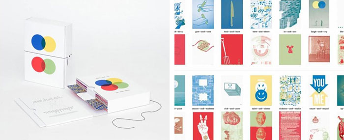
Disturbance Studio in Durban, South Africa put together this book for Amnesty International, pairing together 20 European and 20 African visual artists, designers, illustrators and photographers to explore the similarities and the differences between their respective worldviews and visual sensibilities.
Communication and the cross-pollination of ideas and styles have been actively encouraged, and the resulting posters/publication form a vivid dialogue centred on the notion of Them–and–Us, and the broader themes of tolerance and intolerance, as seen from their respective cultural viewpoints. The publication profiles all the artists involved as well as interviews with each artist, there are also excerpts of discussions taken from the online forum used by the participants to debate their individual approaches.
Book That Never Shuts Up, Bronze
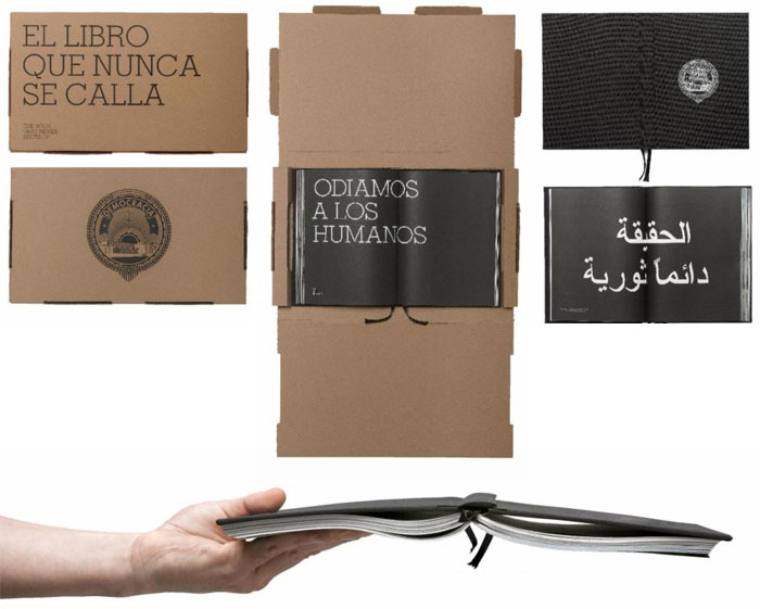
Spain’s F33 designed this book for the Festival la Mar de Músicas featuring the work of Democracy, a collective of artists.
Our first step was to soak up Democracy’s artistic vision and plunge into the more personal nature of their projects. …their projects are outspoken rough, well-rounded and carried out because they really believe in them. Democracy is not intimidated by anything or anyone, so we had to create a book that never shuts up, screaming at each instant, not caring about the consequences, a book that could not be silenced by anyone unless it was destroyed. And so was born ‘the book that never shuts up.’
Beer Coaster Annual Report, Silver
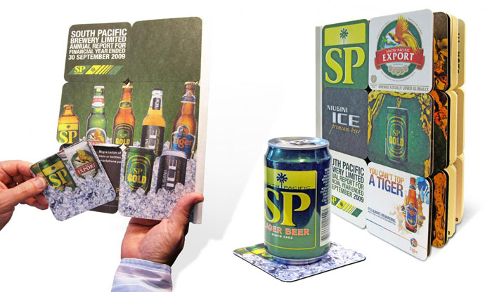
Australia’s George Patterson Y&R created an annual report for Asia Pacific Breweries, made entirely of beer coasters.
Being an annual report for a brewery, the idea presented itself quite quickly. We came up with the idea of creating a book of coasters. Each coater in the book is perforated so that you can easily remove it. Thus never being short of a beer coaster again. The coasters feature different brands and figures of each of the products available through SP Breweries.
Candle Projector, Silver
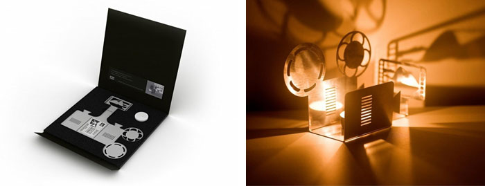
Industria Nacional and Dialogo Design created this special invitation for the Vivo Brazilian Movie Awards which folds up to create a candle-lit film projector.
With the concept 'Rio is Cinema', we produced an invitation that could become a tangible object that people could relate to. Using laser cutting, a folded projector with a candle projects the image of one the most popular and filmed scene of the city: the Sugar Loaf mountains. The movement of the candle flame gives the feeling of an old film projection, asserting the Rio’s timeless vocation to film making.
Cutter Art of Olfa, Silver
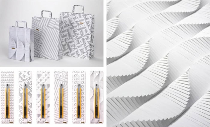
Using a Olfa paper cutter, Dentsu of Tokyo, Japan transformed paper and polystyrene board into artwork used in advertising and packaging for the company.
We spent an entire year cutting paper… Detailed and repeated patterns are overwhelming to look at and they succeeded in getting people deeply involved in the posters. The created patterns were shot two ways, one overhead and the other with perspective to show both density and scale. By using a paper cutter and paper, both of which can be found anywhere, we were able to create memorable geometrical designs that nobody had ever seen before. The same patterns were used for a number of items, such as business cards and envelopes.
Quitting Calendar, Gold
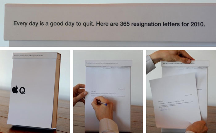
Marketing company Jung von Matt of Hamburg, Germany created this self-promotional calendar as a recruitment tool.
We gave our candidates an A4 size tear-off calendar that contained a ready-made quitting letter for each and every day of the year: 365 entertaining letters that just had to be signed and handed in. We came up with the most absurd quitting reasons, made fun of the whole advertising industry and used elements of a creative’s everyday life to design visual quitting art works. This way we reminded our desired candidates every day how inspired working at Jung von Matt is. And we made quitting one’s job as easy as never before.
Mars Messages, Gold
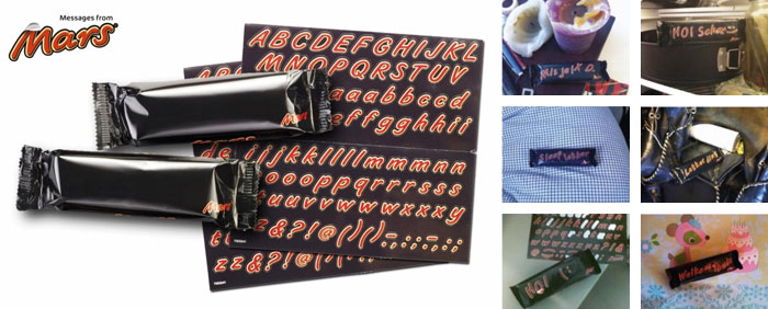
Amsterdam’s HV BBDO designed this ‘blank canvas’ Mars bar wrapper, giving youngsters the opportunity to have some fun with the iconic brand.
We erased the logo from the Mars bar thereby creating a black bar. We developed a set of stickers with the complete alphabet in Mars typography, including punctuation marks. This way the bar became an interactive object that gave people the possibility to create their own messages and give these to friends, colleagues or family. Interaction was thereby created through the heart of the brand: on the package where normally the logo is printed.
Tamiya Business Card, Gold
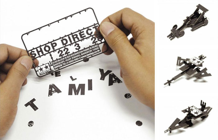
CreativeJuice\Bangkok designed a unique business card for the Tamiya model kit shop in Thailand. The business card itself acts a sample modeling kit for the brand.
The novelty of the concept became a topic of conversation between modeling enthusiasts, leading to people rushing to the shops, specifically requesting a name card.
Borkebjs, Gold
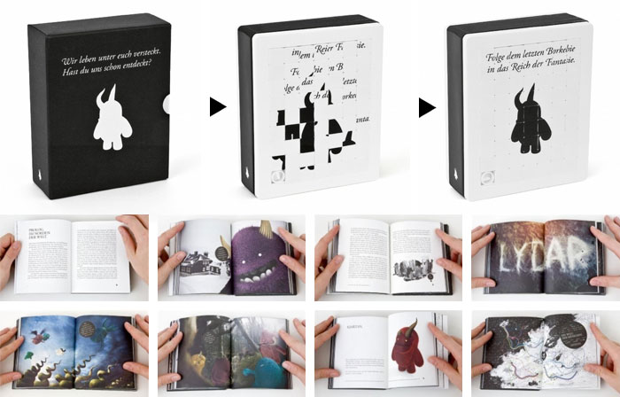
Borkebjs is a children’s book, designed by Kolle Rebbe and KOREFE of Hamburg, Germany.
The Borkebjs are the heroes of this modern 332-page fairy tale book, which casts a spell on children and adults alike. The book is all about the adventures of ten furry creatures who you can only see if you use your imagination. The book plays with this idea in its design. The message on the cover of the book isn’t immediately visible to everyone. However, people who see the book’s cover as a game can assemble the title and find the 'entrance' into the realm of fantasy.
The Earphones Note, Gold
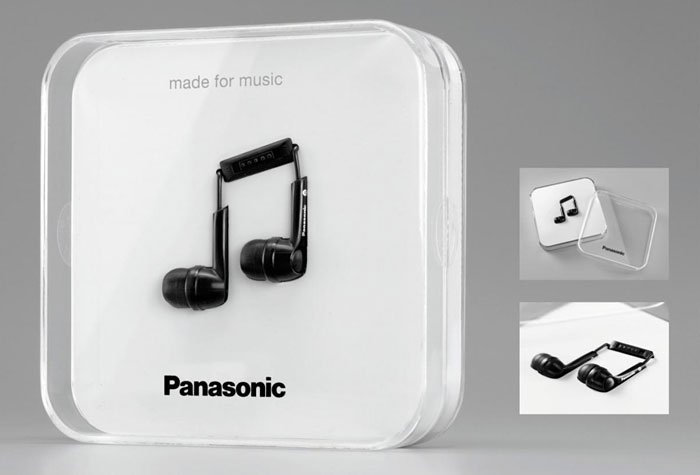
Berlin’s Scholz & Friends created this package for Panasonic headphones, using the actual product as a design element.
The packaging uses the universal symbol for music: the note. By specially arranging the earphones inside a special box they appear to look like two eighth notes. So the earphones show at first sight for whom they are made: for passionate music lovers.
Bending the Rules, Gold
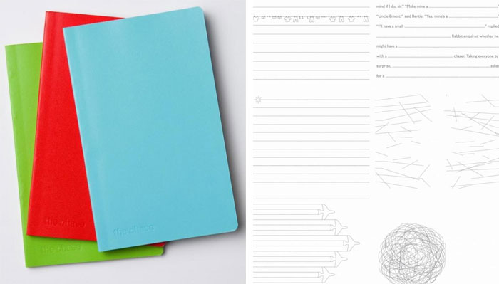
Manchester, UK graphic design and branding consultancy The Chase created this self-promotional notebook, putting a unique twist on standard rule-lined paper.
After deciding upon producing a notebook that can be used everyday, the real challenge was how to make it different from other notebooks clients might have and how to them engaged enough to use it all the way through. One of the good things about working on self promotional items, a perfect opportunity to really bend the rules.
You can see the full list of award-winners at the Cannes Lions website.
Also see:
- Award-winning identities from Cannes Lions 2010
- Award-winning print design from Cannes Lions 2009
- Award-winning identities from Cannes Lions 2009
- Award-winning package design from The Dieline
Filed under: design
Comments