Design discussions: Paul Shaw and the NYC Subway
Comments: +
February 26 2010
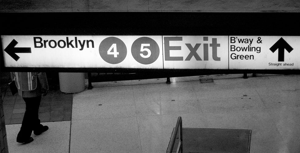
There is a common misbelief that Helvetica is the signage typeface of the New York City subway system. In this ‘Design discussions’, we talk to the author who has uncovered the truth (maybe) behind the story.
Trained as a historian, Paul Shaw has spent the past thirty years as a graphic designer specializing in letterforms. His work has been recognized with awards from the Type Directors Club, Art Directors Club, and AIGA (among others), while his research in design history has garnered numerous grants and achievements.
Originally written as an essay for AIGA Voice, Shaw has recently published Helvetica and the New York Subway System: The True (Maybe) Story. The book provides a fascinating visual history of the typography behind New York’s subway system, specifically detailing the iconic signage system designed by Massimo Vignelli and Bob Noorda at Unimark International in the late 1960s.
We had the opportunity to chat with Shaw about his work and his book.
IDSGN: You hold degrees in American Studies and American History. How did go from historian to graphic designer?
PAUL SHAW: I thought of going to Cooper Union or an art school but decided that a liberal arts education would be better in the long run. So I went to Reed College. The American Studies major was a way of combining literature and history. That led me to the graduate program in American History at Columbia University. But to pay for graduate school I began doing calligraphy, lettering and, eventually, graphic design. This was in the early 1980s before computers became ensconced in graphic design. It was all paste-ups and mechanicals.
You seem to have the ability to merge the worlds of history and design together in your work, a skill which is evident in many of your typeface designs. Has your background in history helped your career as a designer?
My typeface designs have emerged from my longtime interest in lettering and calligraphy. I have always sketched examples of letters from the past, whether from inscriptions, manuscripts, posters, book jackets or advertising. When I met Garrett Boge, owner of LetterPerfect, one of the first digital type foundries, I suggested to him that it would be fun to turn some of the great lettering of the past into type. He was intrigued and that led first to Kolo, based on lettering from the Vienna Secession (not just by Koloman Moser but from his colleagues such as Gustav Klimt and Joseph Auchentaller), and then to the Florentine Set and the Baroque Set.
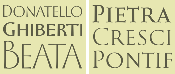
The Quattrocento sans serif inscriptional lettering had always fascinated me and after my first trip to Italy in 1991 I was very eager to do one or more typefaces in that vein. Thus, Donatello, Ghiberti and Beata (which was primarily Garrett's design). The Baroque Set of Cresci, Pontif and Pietra was a natural follow-up. Garrett was the driving force behind it. And he urged me to do the Old Claude take-off on Garamond. The last historically-influenced typeface we tried to do never saw the light of day due to other obligations. It was based on the work of the Paduan calligrapher Bartolomeo Sanvito that I had explored in depth in 1995. There is the possibility that it will be resurrected this year.
Over the past 30 years you must have seen a lot of changes in the graphic design industry, do you think designers are better off today?
Being able to set type oneself on a computer is a huge advancement over having to order type from a type house, then paste it down on a board and, if it is wrong in any way, repeat the process. And at the end, you paid for the words you set, not for a font. And thus, you had to do the whole thing over again for the next client, the next project. Today, type is cheap and plentiful. And immediate.
When I started out phototype was dominant. I had no idea that digital type was just around the corner and I decided to learn about metal type to better understand my profession. I sought out type houses that still had foundry type and Linotype machines and used proofs of such type in my mechanicals. And even though I became aware of the nascent efforts of Adobe, Bitstream, Compugraphic, Dr.-Ing. R. Hell et al in the early 1980s, I didn’t begin to trust digital fonts until about 1990 after Adobe Garamond came out.
Computers have shrunk the design process so that one person can, with the right software, do everything that used to require a small team to do. What has been lost in this shift is the collaborative, collegial aspect of design and the notion of expertise. I miss having experts to do my typesetting, my photo retouching, my photography, my proofreading, and so on. (I did my own calligraphy and lettering and sometimes was forced by clients to do really bad illustration.) One reason why we see sloppy texts and sloppy typography today is not because there are flaws in the page design programs or the fonts we use, or because the designers don’t know better. Most of the designers do know better but they do not have the time to fuss about such things.
Computers have shrunk the design process so that one person can…do everything… What has been lost in this shift is the collaborative, collegial aspect of design and the notion of expertise. I miss having experts to do my typesetting, my photo retouching, my photography, my proofreading…
You’ve designed logos and custom lettering for household brands like Avon, Lord & Taylor, Rolex, Clairol and Estée Lauder, is there a specific project you are most proud of?
I am probably most proud of the lettering in the Origins logo done for Estée Lauder. But that is partly because it has survived, unlike my Barbie logo or my Splash logo for Campbell Soup’s fruit juice. Both of those have already been replaced by newer logos.

I am also proud of the lettering that I did for Diana Krall’s Love Scenes CD because I managed to give her name the look of a logo. When the CD won a Grammy I thought she would re-use the lettering on her next CD as a brand (like Danielle Steel does with her books). But she didn’t and her follow-up release bombed. Every time I see the Love Scenes CD with Diana Krall’s signature hanging behind the check-out desk at J&R Music World I am reminded of her folly.
You’ve been known for photographing lettering around New York City, is this how the subway book began?
My photographs of lettering in New York fed the imagery in the book, but the real spark came from two events: seeing the Helvetica movie by Gary Hustwit in 2007 and then a few weeks later listening to Massimo Vignelli and Wim Crouwel at an AIGA NY dialogue moderated by Alice Twemlow. In the movie and in the dialogue it was implied-though they did not say outright-that Helvetica was the typeface of the subway signage because Vignelli chose it decades ago. I knew this was not true and I set out to find what had happened.
The book’s title, Helvetica and the New York Subway System: The True (Maybe) Story, alludes to a certain mystery…
The subtitle was done because I was not sure I had solved the mystery of why Unimark and the NYCTA chose Standard instead of Helvetica back in 1966 and again in 1970. Massimo Vignelli said he could not remember why and Bob Noorda wasn’t sure either. I tested out all of the excuses I could think of—Helvetica had not been imported to the USA, Helvetica was not available as a film font, Helvetica was not available from New York City type houses, Helvetica was not available from the TA’s preferred vendor, and so on—but could not find irrefutable evidence of what had happened. Although I think the latter excuse is the answer, I can not prove it. And the same is true for why the TA shifted from black-on-white signs to white-on-black signs. And for why Standard was dropped in 1989 in favor of Helvetica. I have lots of circumstantial evidence, but no smoking guns.
What I do have are smoking guns that show that Standard was the subway typeface not only back in 1966 but as late as 1988. Thus, I wanted to indicate that my book was going to tell the true story of the system’s typeface vis a vis Helvetica. Yet, it is only the true story for now. If someone comes forth with new recollections or documents that contradict what I have surmised then I will have to rewrite the book.
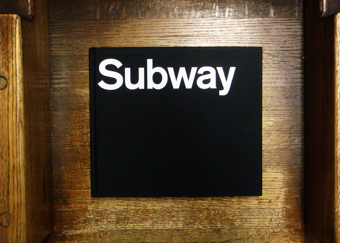
For me this book was about solving a mystery and then telling a story. The debate about a typeface got pushed aside.
The book originally began as an essay written for AIGA Voice. What prompted you to dive even further into its history?
The book really began as a quest to answer a simple question: Why did Massimo Vignelli not specify Helvetica for the NYCTA signage if he thought it was the best typeface in the world? Trying to answer that question led me to talk to many people I had previously been unaware of and to realize that there was a more convoluted history to the subway’s signage than was noted in the literature on the subject or was even evident to someone like myself who has lived in New York City for over 30 years. The changes over time were either so subtle that they went unnoticed at the time or so subservient to the basic issues of using and navigating the system that they were quickly forgotten.
Those who have moved to New York since 1990 have no idea what the subway was like in the 1970s and early 1980s. I often forget myself how dirty, noisy, smelly and generally scary most of the stations used to be. Who bothered to pay attention to the typeface on the signs when you were covering your ears to block out the sounds of screeching metal wheels, pinching your nose to avoid the smell of urine on the platforms and in the passageways, looking over your shoulder and all around you to see if any muggers were lurking, and sidestepping trash and rats.
The deeper history of the signage took me back to those days and beyond to the 1960s. I get fascinated in discovering why things happened and what accidents of personality, time and place were involved. For me this book was about solving a mystery and then telling a story. The debate about a typeface got pushed aside.
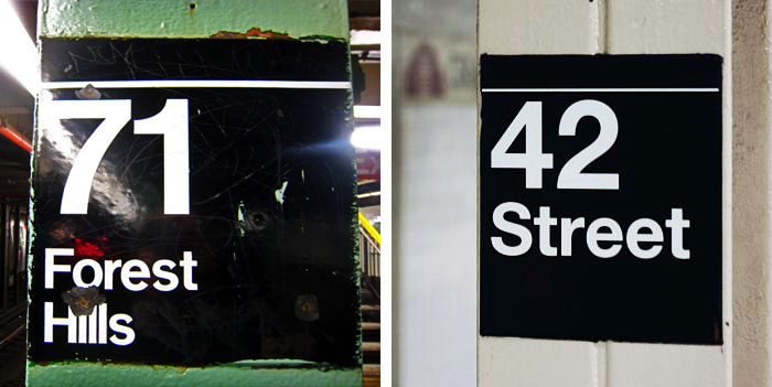
I often forget myself how dirty, noisy, smelly and generally scary most of the stations used to be. Who bothered to pay attention to the typeface on the signs when you were covering your ears to block out the sounds of screeching metal wheels, pinching your nose to avoid the smell of urine on the platforms and in the passageways, looking over your shoulder and all around you to see if any muggers were lurking, and sidestepping trash and rats.
What can you tell me about Standard? Why do you think it was chosen over Helvetica originally, especially by Vignelli who is known for liking Helvetica?
First off, Standard Medium is not some oddball typeface from 1960s. Standard was the American and English name for Akzidenz Grotesk, the typeface that was the basis for Neue Haas Grotesk (as Helvetica was originally known). Standard was very popular among modernist designers in the United States because it was the preferred typeface among Swiss designers at the time (more so than Univers or Helvetica). What Massimo said what he most liked about Helvetica vis a vis Standard was that the former had no shoulders. That meant that it could be set very tightly. This was revolutionary for a foundry typeface. Other typefaces could only be set tightly by cutting up proofs and making a mechanical (which designers such as Herb Lubalin were doing from the mid-1950s on). Massimo has never praised Helvetica for any other reason as far as I know. Except that in the manual that Unimark made for Varian the text says that Helvetica is the most legible of all typefaces. The same claim is made two years later in the manual for the NYCTA about Standard!
I think that Massimo probably wanted Helvetica for the sign system. I am not sure if Bob Noorda did, though. Bob had made his own typeface for the Milano Metro rather than use either Standard or Helvetica. And I suspect he would have liked to do the same thing for the New York City subway but that the TA was not going to pay for the cost involved and may have also resisted because the sign shop people probably didn’t want to deal with a typeface that was not off-the-rack. Either Massimo and Bob proposed Helvetica to the TA and then were told that their suppliers did not have the typeface and didn’t want to pay to get it but that they did have the similar-looking one called Standard; or Massimo and Bob asked the TA what typefaces they had available and settled on Standard as the best match to Helvetica. As Massimo has said to me, the sign system was more important than the typeface. And, it should be remembered, the signs were not being made with foundry type, so it was possible to set Standard as tightly as Helvetica.

Walking into a subway station in New York can sometimes feels like walking into a museum, with a mishmash of signage from decades past including mosaic tiles from the early 1900s. With nearly 500 subway stations, not to mention thousands of buses and trains, do you think we’ll ever see a unified system?
No. The mosaics, terracotta and cut stone signs are all being deliberately preserved as art. This is something that began informally in the late 1970s and is now officially the policy. There is even someone in charge of historic preservation who oversees the mosaics et al. Her problem is having enough money to keep things in good shape.
However, in terms of modern signage the system is rapidly becoming more uniform-much to my dismay. I enjoy finding the old signs that survive, but it is remarkable how few of them there are. The policy of the MTA back in the 1970s and even today is to replace old signs only when a station is being renovated overall. And that has happened at a rapid rate since the early 1990s. Most of us are unaware of this because we tend to be Manhattan-centric (or Williamsburg-centric). But if you ride the J train for instance you will only see modern white-on-black signs set in Helvetica. And the same thing is occurring on the Sea Beach (B/Q) in Brooklyn and the no. 6 line in the Bronx. The MTA sees no economic reason to replace signs that are functional if something else major is not being done to a station. And they are right. However, their attitude has led to perfectly functional (and in some cases better) signs set in Standard being replaced when stations are renovated (see Chambers Street on the IRT and the current work at Columbus Circle on the no. 1 line).
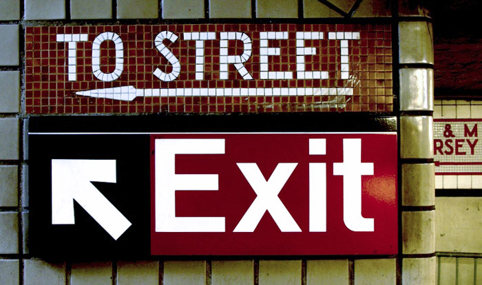
When things become too uniform I find them dull and dispiriting. Right now I am getting nostalgic for the yellowish tile of the past. The new very bright white tiles are antiseptic and look odd in stations where everything else remains grimy and old…
Is there something nostalgic about the randomness we would miss if the MTA did Helvetica-ize everything?
For me, the answer is yes. When things become too uniform I find them dull and dispiriting. Right now I am getting nostalgic for the yellowish tile of the past. The new very bright white tiles are antiseptic and look odd in stations where everything else remains grimy and old (and always will since the cost of replacing the infrastructure of track girders, water pipes, drains, signals, etc. is probably too high). What I like best are the old stations that have been sensitively renovated and restored to what they probably looked like when new: eg. Rector Street (no. 1), 33rd Street (no. 6), Wall Street (nos. 4 & 5), Prince Street (R, W), etc. What I hate are those stations with ersatz or post-modern pretensions such as 161st Street-Yankee Stadium (B, D), Atlantic Avenue (2, 3, 4, 5) or 207th Street (A).
With a list of sources three pages long, its evident a lot of research was put into this book. What did you discover that surprised you the most?
How much the current sign system owes to the Unimark design of 1966 despite the fact that the modular concept has been discarded, the colors have been inverted, the typeface has been changed, and the range of lettering sizes has been altered and ignored. Somehow, the essential DNA that Bob and Massimo created over 40 years ago is still present. The signs are not perfect, but they work.
Finally, as someone with such vast knowledge of type history, is there anything that you feel has been overlooked in recent history?
Where do I begin? A designer such as Georg Trump is virtually forgotten today, despite having done the superb Trump Medieval and the influential City (the basis for Paul Rand’s IBM logo). Other German designers of the interwar years such as FHE Schneidler and ER Weiss are also ignored today. I am interested in the typefaces of the past that are visually successfully despite being inconsistent and even having “wrong” letters. Too many fonts today are overly uniform.
Helvetica and the New York City Subway System was printed in a 500 copy limited edition run (which is now sold out). A softcover edition is currently being discussed with publishers. The book has been awarded a Certificate of Typographic Excellence by the Type Directors Club and will appear their 56th Awards Exhibition and their annual Typography 31. For more information see helveticasubway.com.
Paul Shaw currently teaches calligraphy and typography at Parsons School of Design, and graphic design history at the School of Visual Arts in New York. He is currently working on several projects including a multi-volume book on digital typefaces and a book about lettering in New York City. Shaw is also a contributing editor for Print magazine and the publisher of Blue Pencil, a blog about design history and letterforms.
Also see:
Filed under: design
Comments