Designing the tasteless
Comments: +
November 19 2009
")
To hawk a centuries-old spirit, vodka manufacturers concoct innovative flavors and get creative with the bottle. Bacon-flavored shot, anyone?
Vodka. It’s the most basic of spirits—colorless, odorless, and nearly tasteless. The drink of the czars, produced in Russia and Poland since the end of the 9th century, presents modern distillers with a thorny dilemma: how best to sell an essentially neutral product to a restless generation that demands a wide range of choice in everything they buy, from triple soy half-caff lattes to sneakers? Two front running approaches are to offer as many different flavors as Vitamin Water, and to package the product in a memorable bottle.
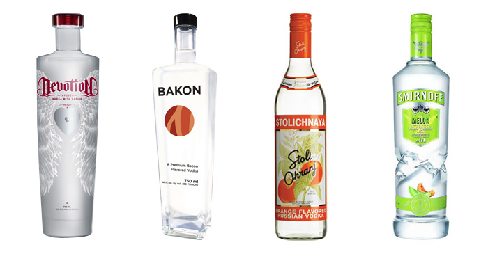
The many flavored vodkas (L-R): Devotion, Bakon, Stolichnaya’s Stoli Ohranj, Smirnoff Melon.
Adding flavors is not a new idea. To mask the off-tastes of early vodkas caused by crude production methods (some were filtered through sand or felt), distillers added fruit, herbs or spices including acorn, cherry, and horseradish. But only the 21st century could have conceived of protein vodka. Devotion Vodka packs as much dairy-derived casein protein as a Balance Bar or protein shake. Then there’s Bakon: bacon flavored vodka (vegan jackpot: the actual flavoring is not derived from real bacon so it’s guilt-free).
Before you can convince a consumer to buy the vodka, though, the package needs to somehow pique his interest first. Stolichnaya chose to keep their plain, basic bottle shape and to vary the label design for its flavored versions. The timeless illustrations speak to an adult customer looking for a change of pace from plain spirits, yet also wanting to stick with a familiar trusted brand.
Smirnoff Twisted took a louder approach to marketing its flavored vodkas, available in 12 versions including melon and pomegranate. The bottle seemingly has been possessed by a tornado round about its midsection. Labels are bright and garish. Overall, the product looks custom-made for a frat party or a 20-something ladies drink free night. The brand is clearly aiming to resonate with a younger, less sophisticated customer.
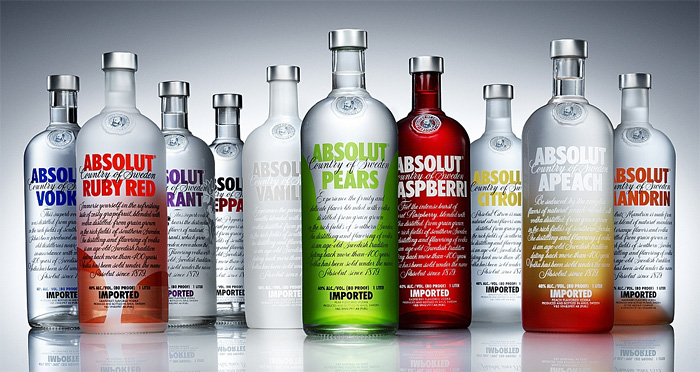
Absolut Flavors: the (large) family of Absolut vodkas.
Some brands take a loftier view, striving to align themselves in a consumer’s mind as the equivalent of works of art. From its launch in 1979, Absolut positioned itself visually as an artistic endeavor, using the long running ad campaign “Absolut (fill in the blank)” to link the product’s image with creative interpretation. Like Stolichnaya, they keep the bottle shape consistent and change up the typography and color schemes for their different varieties.
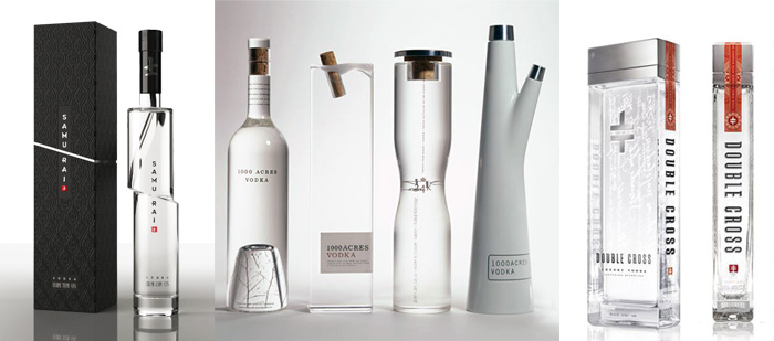
Vodka packaging trends (L-R): Samurai, 1000 Acres, Double Cross.
Moscow-based designer Arthur Schreiber’s package for Samurai vodka is at the moment just a concept. The box and graphics are gorgeous, but even more rewarding from a design perspective is the way the bottle looks as though it had been cut clean through with a sword, then restacked with the pieces slightly off-kilter.
Arnell’s design proposal for 1000 Acres vodka shows a number of different sculptural bottle options, and Double Cross claims that its bottle is “unlike anything in the world. Elegant. Powerful. Graceful. Striking. A sacred vessel.” Well, maybe. The thin, slab-shaped bottle is gracefully proportioned, but frankly the graphics remind me a lot of the Tazo Tea boxes, striking in their own right but already starting to look a bit dated.
It seems the design challenge of reinventing ways to sell something so basic and simple as vodka perhaps has not been entirely cracked yet. A toast, then, to the next great idea.
Na zdorovie!
Angela Riechers is a graphic designer and second year MFA student in the new Design Criticism program at the School of Visual Arts. Previously, she was Art Director of Home Magazine and taught undergraduate graphic design at SVA and The City College of New York. You can find her design work at www.angelariechers.com, and blog posts at NounVerbDesign.
Filed under: branding
Comments