Firefox refreshes logo
Comments: +
June 22 2009

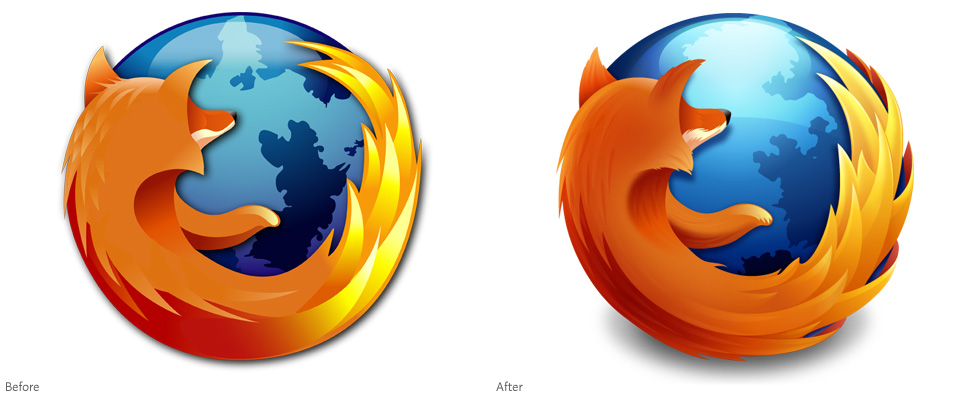
Although many people will never realize the change, Mozilla has just announced a new logo for the upcoming Firefox 3.5.
The (slightly) refreshed identity was designed by Anthony Piraino from the Iconfactory, directed by the logo's original designer along with the team at Mozilla. As described in the extensive creative brief, the goal was to modernize the overall look of the logo. Did it really look out of date?
You have to look close (grab your magnifying glass), but the most notable differences include finer hair detail and depth shading on the fox, flames that wrap around the globe, and a few heavy coats of gloss on the globe itself. I don't know if it really looks more modern, but it is definitely more detailed. Which is not necessarily a good thing for an identity—a lot of the charm of the original logo was in its iconic stylization. But truth be told, it looks pretty much the same.

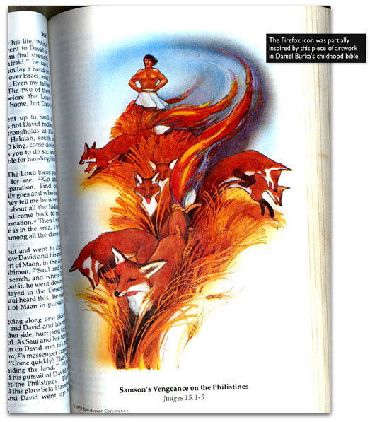
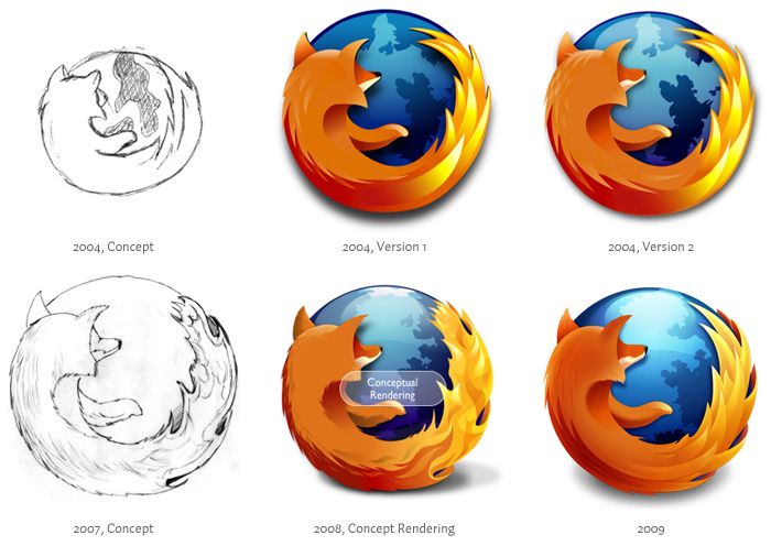
The original Firefox logo was designed by Jon Hicks in 2004, based on a concept from Daniel Burka and sketched by Stephen Desroches (discussed here). Daniel Burka's concept was partially inspired by a piece of artwork found in his childhood bible (pictured above), before going though its many iterations:

...and after all that work, it's hard to notice much difference in your toolbar:
![]()
So was the redesign worth it? Read more about it on Alex Faaborg's blog at Mozilla.
Filed under: branding
Comments