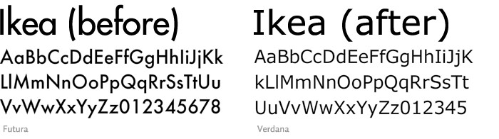
IKEA says goodbye to Futura
Comments: +
August 26 2009
After 50 years of the iconic Futura typeface, IKEA has made a switch to… Verdana?
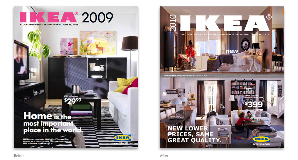
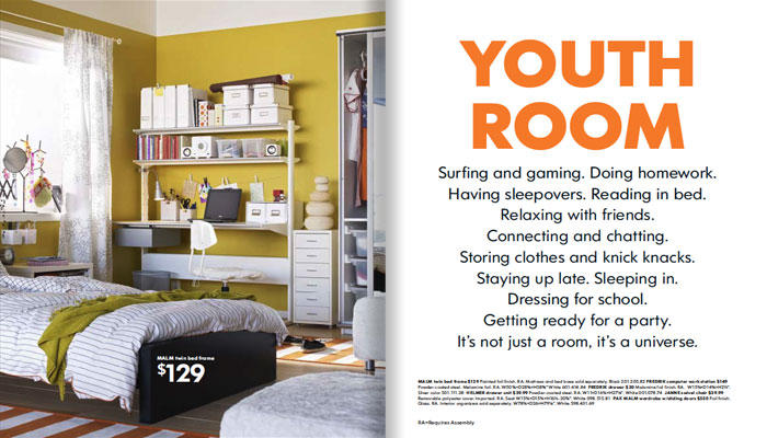
The 2010 IKEA catalog, now arriving at doorsteps around the world, reveals the company’s choice to change all typography to the Microsoft font that every web designer has grown to hate (you can already hear the cries). Verdana, specifically designed for on-screen readability, first shipped with Internet Explorer 3 in 1996. Being one of the better looking ‘Core fonts for the web’—a limited selection which also includes Arial, Comic Sans, and Times New Roman—Verdana has become one of the most widely used fonts on the web (but rarely ever used in print).
The font will replace IKEA Sans (a customized version of Futura by Robin Nicholas), and IKEA Serif (based on Century Schoolbook). In an interview with the Swedish design magazine Cap & Design, IKEA’s Ivana Hrdlickova says the main reason for the switch was to allow the company to use the same typeface in all countries (current IKEA typefaces do not contain Asian characters, for example). Being that Verdana was designed for the web, it also allows the company’s image to remain consistent online and in print.
Before

After


The 2010 edition of the world’s third most printed publication (next to the Bible and Harry Potter), is now available online. For more on Futura, check out Know your type: Futura.
via Typophile
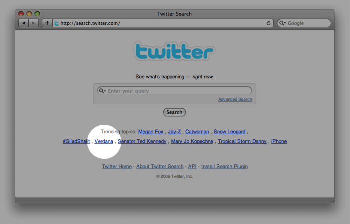
UPDATE: People are passionate about IKEA’s typography, Verdana has made it to Twitter’s trending topics and there is already an online petition to replace it (Aug 26, 2009).
The Verdana controversy has been picked up by Business Week and Brand New, even the mainstream media (Time and Associated Press) is talking about it. IKEA spokeswoman Camilla Meiby responds to AP (Aug 31, 2009):
We're surprised, but I think it's mainly experts who have expressed their views, people who are interested in fonts. I don't think the broad public is that interested.
Verdana is a simple, cost-effective font which works well in all media and languages.
More mainstream coverage in the Saturday edition of the New York Times, mentions idsgn and reader comments (Sep 5, 2009).
Filed under: typography
Comments