Introducing Photo-Lettering (to a new generation)
Comments: +
June 12 2009
Once a mainstay of the pre-digital design & advertising industry, Photo-Lettering is making a comeback thanks to independent type foundry House Industries.
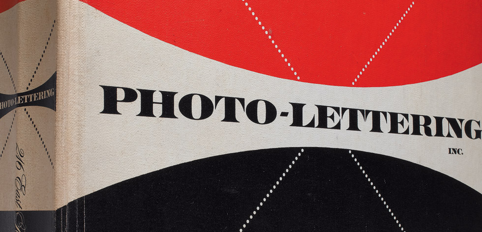
The Photo-Lettering library, a collection of film-based display type, was widely used by art directors and designers from 1936 until the rise of desktop publishing. Pioneering type house Photo-Lettering, Inc. (or PLINC, as it was affectionately known) utilized photo technology in the production of commercial typography and lettering, offering the largest library from a single foundry (before or since). Featuring type hand-drawn by the likes of Herb Lubalin, Milton Glaser and Seymour Chwast, New York City-based PLINC employed such influential designers as Ed Benguiat. Since going out of business in the late 1980s, graphic designers today best know Photo-Lettering from its highly collected type catalogs.
The alphabet styles in this collection, many of which took over 200 hours to complete, were drawn with pen and ink to exacting standards by veteran lettering artists. I know....during my 35 years employed by Photo-Lettering I produced over 500 complete fonts. The acquisition of this collection represents historically the birth and death of an industry, but now I can rest assured that it will be preserved with dedication to the typographic arts
- Ed Benguiat, formerly of Photo-Lettering, Inc.
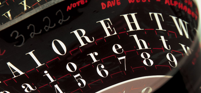
In 2003, House Industries purchased Photo-Lettering's entire assets. Taking up about 2,500 cubic feet of space, the library contains film negatives and positives of most of the 6,5000 alphabets produced in the company's 55 years. Taking the massive project upon themselves, House is painstakingly digitizing alphabets from the collection and now is about to launch PhotoLettering.com. The web service will allow a new generation of designers to go back in time and access the same hand-designed type used in the days before Illustrator and Photoshop.
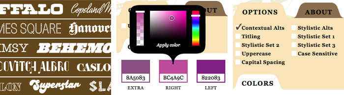
The Photo-Lettering interface has allowed us to reach beyond the rigid confines of typography to offer extended features such as layering, color control and multiple master interpolation over six axes. With some of the most talented minds in display typography behind this new display lettering system, users of the system will enjoy the same refined typography as the the original Photo-Lettering customers.
So, how does it work?
I had the pleasure of running through a beta version of Photo-Lettering and talking with House Industries on what we can expect. While it's not meant to replace desktop fonts by any means, Photo-Lettering offers designers an exciting new option for creating headline type with some unique features that are just not possible (or at least much harder) to create with regular fonts. Not to mention, providing access to a vast library of vintage type. “The original Photo-Lettering Inc. was successful for over 60 years because it was a time-saver for art directors and designers. We think that model is still valid today in the digital realm,” says Rich Roat of House Industries.
Some of the typefaces are a touch wacky—I don't see myself using “Tiki Palms” or “Voodoo House” any time soon—but there are some nice gems never available before (digitally). Each (58 of them so far in the beta version) has its own set of options, some being very simple, others allowing you to adjust things like weights, styles and alternates. House plans to add new alphabets at a rate of one to two per month as the site progresses.
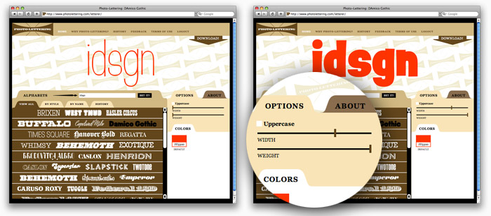
I was immediately impressed with D'Amico Gothic, which allows you to create custom weights and widths using two simple slider bars. Obviously going way beyond the standard Light, Medium, and Bold:
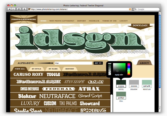
Another example, Federal, is a four-layer alphabet which allows you to set different layer colors (and transparencies) individually to create complex-looking type:
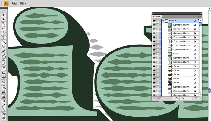
Once you've prepared your customized type in the (very brown) web interface, the final step is downloading your type in PDF format (they also plan to offer JPG, GIF and PNG downloads). I was able to open the PDF in Illustrator complete with editable paths and transparencies, giving the opton to further edit colors and any imperfections.
Overall, it's a very quick and easy process. I can definitely see the benefit for times when you are looking for an interesting typeface for a headline or wordmark, and having the ability to completely customize it is a liberating experience. Prices sound pretty good too. House plans to offer several subscription tiers as well as single “one-click” download purchasing for under $10. With subscriptions, users will be able to set headlines for under a dollar each depending on the tier.
The fully-functioning site is expected to launch in November of this year at PhotoLettering.com.
Filed under: typography
Comments