Know your type: Verlag
Comments: +
May 18 2009
This is the second entry in the ‘Know your type’ series, where we take a look into the origins of some of the most interesting and commonly used typefaces in design today. This month, we look at the history of Hoefler & Frere-Jones’ Verlag.
Inspired by the Guggenheim's Art Deco lettering
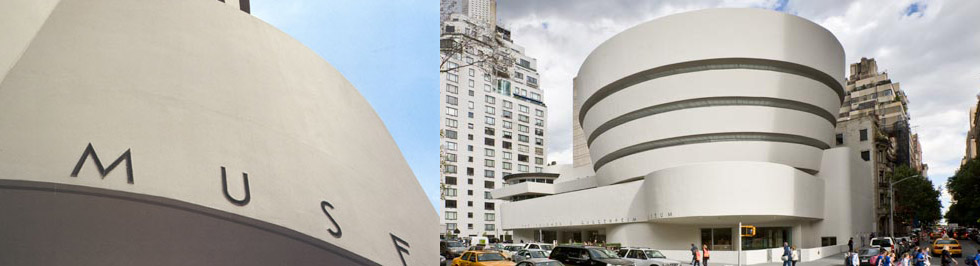
This year the Solomon R. Guggenheim Museum celebrates its 50th anniversary in New York. Designed by American architect Frank Lloyd Wright in the 1950's, The Guggenheim is one of 20th century's most important architectural landmarks. The museum is the permanent home to a renowned collection of modern and contemporary art—but it's the lettering on the outside that we came to see.
Frank Lloyd Wright’s iconic Art Deco lettering on the facade of the Guggenheim is the basis for the typeface we know today as Verlag. In 1996, when designing the Guggenheim magazine, Abbott Miller (of Pentagram) approched Jonathan Hoefler (of Hoefler & Frere-Jones) to create a custom typeface for the publication. Hoefler referenced Wright's iconic lettering and designed the custom typeface in various weights and italic and bold versions for exclusive use in the magazine.
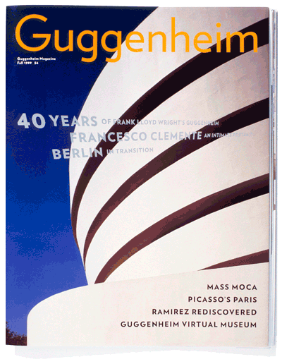
From the Guggenheim to 'celebrity' status
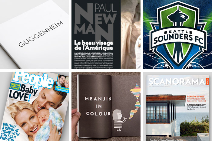
Over the years the typeface became the de facto brand for Guggenheim organization. Initially licenced exclusively, the typeface was ultimately released publically by Hoefler & Frere-Jones (as Verlag) in 2006 in an incredible 30 styles (in weights ranging from Extra Light to Black, and alternate widths: Condensed and Compressed) and covering over 100 languages. It can now be seen in use on many logos, publications and websites around the world—including the celebrity-studded People Magazine.
From Hoefler & Frere-Jones:
Because the fonts would ultimately represent a range of individual artistic voices — from Cézanne to Kandinsky to Matthew Barney — Verlag was carefully planned so that its distinct personality would be checked by a sense of objectivity.
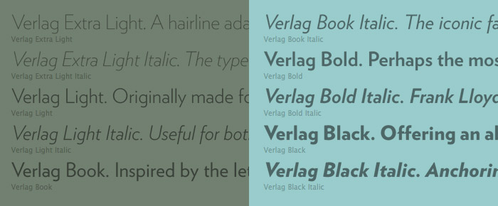
From the rationalist geometric designs of the Bauhaus school, such as Futura (1927) and Erbar (1929), Verlag gets its crispness and its meticulous planning. Verlag’s “fairminded” quality is rooted in the newsier sans serifs designed for linecasting machines, such as Ludlow Tempo and Intertype Vogue (both 1930), both staples of the Midwestern newsroom for much of the century. But unlike any of its forbears, Verlag includes a comprehensive and complete range of styles: five weights, each in three different widths, each including the often-neglected companion italic.
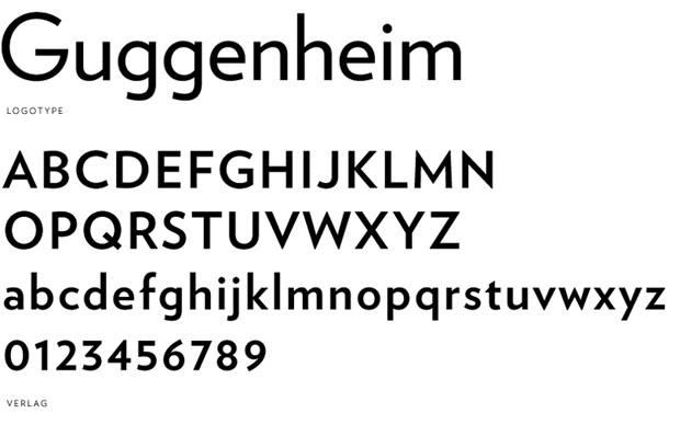
Verlag remains an integral part of the Guggenheim to this day. Recently, when the Guggenheim Foundation returned to Abbot Miller to design a new identity for their parent company, Miller once again turned to Verlag. This time setting the logotype in all uppercase "to suggest a kind of über-Guggenheim or parent organization". To read more about it check out the post at Pentagram, which was the inspiration for this Know your type.
Usage
Filed under: typography
Comments