Making sense of health care
Comments: +
August 5 2009
US health care reform is a complicated issue which seems nobody can agree on (or even fully understand). In an attempt to make sense of it, California-based designer Robert Palmer eases the pain with a new infographic.
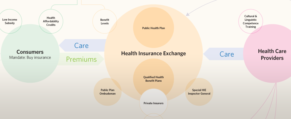
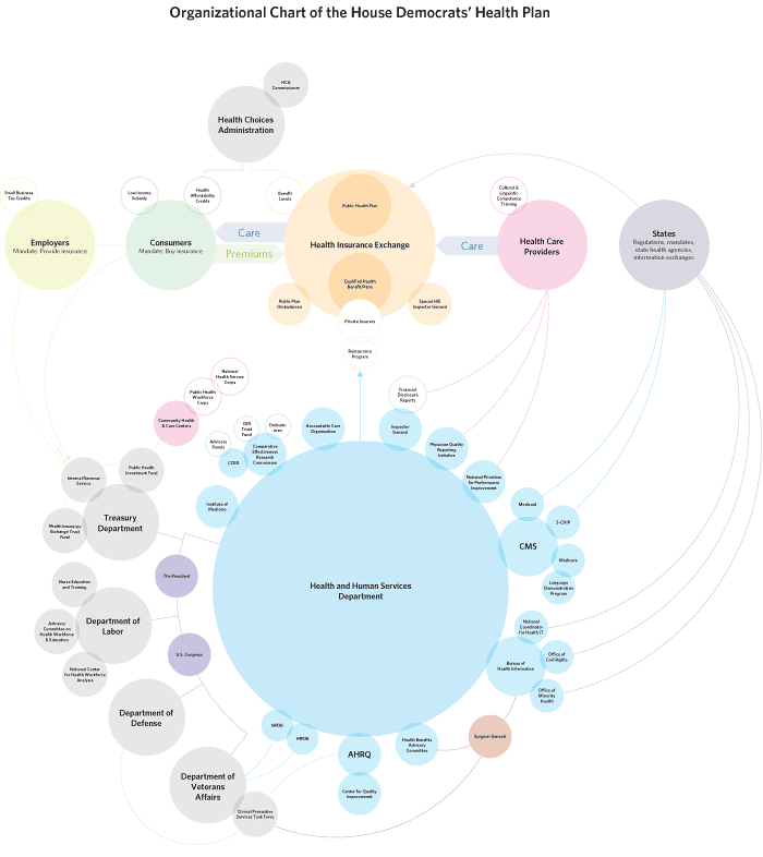
Political chart wars—it began in mid-July when Republication John Boehner released an organizational chart of the House Democrats’ health plan. It was intentionally obfuscating (“Scaring America with badly designed health care infographics,” as GOOD puts it), turning a complicated issue into a visual nightmare. With an emotional response entitled “Do not f**k with graphic designers,” Robert Palmer redesigns the controversial chart.
By releasing your chart, instead of meaningfully educating the public, you willfully obfuscated an already complicated proposal. There is no simple proposal to solve this problem. You instead chose to shout ‘12! 16! 37! 9! 24!’ while we were trying to count something.
So, to try and do my duty both to the country and to information design (a profession and skill you have loudly shat upon), I have taken it upon myself to untangle your delightful chart.
Before (PDF):

After (PDF):
While Palmer admits, “I think Democrats, Republicans, and independents agree that the problem is very complicated, no matter how you visualize it,” its clear good design can make a difference.
via BoingBoing (thanks to Eric Mueller for the tip)
Filed under: infographics
Comments