Mapping the Internet
Comments: +
June 24 2009

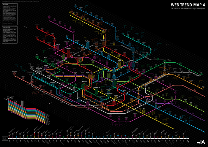
Using Tokyo Metro as a guide, Information Architects maps the world's most influential websites as a virtual subway system.
Information Architects (iA) recently published Web Trend Map 4, the latest version of their popular web diagram. The diagram references a selection of the top 333 websites based on traffic, revenue, age, ownership, and character.
Paying attention to the intersections, we grouped associated websites and ensured every domain is on a line that suits it. As a result, the map produces a web of associations: some provocative, some curious, others ironically accurate.
As a few examples: Twitter is located in Shibuya, the train station with the biggest buzz. Google and its network are placed around Shinjuku, the most highly trafficked station in the world. The New York Times is located in Sugamo, the shopping paradise for Tokyo's grandmothers.
Why Tokyo Metro? Because it works.-From the map's notes
The subway map metaphor beautifully illustrates the interconnectivity and relationships between websites (represented by stations). The height of the station represents the site's popularity while the width illustrates its stability as a business entity. The position on the map indicates if it belongs to the major traffic hubs or the online "suburbs".
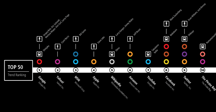
See the (giant) map in its full glory at Flickr. iA are also selling a 33 x 46 inch print version of the map for $49 on their site.
via SpiekerBlog
Filed under: infographics
Comments