Verdana & Georgia grow up
Comments: +
September 16 2009
When IKEA switched to Verdana for their 2010 catalogs, the move was highly criticized. But it looks like IKEA may have the last laugh as Verdana, along with web-safe pal Georgia, are getting a makeover fit for print in 2010.
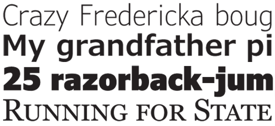
An early sample of the new Verdana & Georgia
Designed by Matthew Carter and hand-hinted by Tom Rickner, the Georgia and Verdana typefaces were originally commissioned by Microsoft in the early days of the web to address the challenges of on-screen display. The fonts were initially released in 1996 with Microsoft’s ‘Core fonts for the Web’ and later shipped with Windows and Max OS, becoming two of the most widely used typefaces on the Internet.
To make the fonts look good at small screen sizes, they were designed with large x-heights, open counters, high bold contrast, extra spacing, and exaggerated features to help distinguish commonly confused letterforms (like the number 1, the lowercase L and the uppercase I)—which is why the text starts to feel awkward at large sizes.
Ascender Corporation (the font’s publisher), Carter & Cone, and Font Bureau have announced a new project in conjunction with Microsoft which intends to optimize the Verdana and Georgia fonts for many new applications, including print. So it looks like there could be hope for IKEA’s 2011 catalog.
idsgn got in touch with Bill Davis from Ascender Corporation, who informed us:
We are busy working on creating condensed weights, and also extending the family from light to black (with italics). We are also working on small caps, additional figure styles, and programming these additional glyphs as OpenType features… As you may know Georgia has old style figures by default, and a lot of folks would love to have lining figures (both proportional and tabular).
By working with Matthew Carter we hope to remain true to the original designs as best we can, and working with FontBureau will allow us to incorporate features that are important to online and print publications.
This project began more than a year ago, and the first of the new typefaces are expected during the first quarter of 2010. When the project is complete, the typefaces will have a light, regular, semibold, bold, and black, with respective italics plus a condensed range of all these—growing each family from 4 fonts to 20.
For more details, see the press release from Ascender Corporation.
Filed under: typography
Comments