Typography on the web
Comments: +
November 11 2009

Typography on the web
The future of web typography is coming… but not quick enough.
Nearly fifteen years ago Netscape 1.0 was introduced. With it came the (now retired) <font> tag, giving web designers the ability to adjust text sizes in HTML for the first time.
Since then, the Internet has progressed enormously in many ways—you can watch your favorite TV show in high-definition or chat in real-time with friends across the world—but little has changed in the world of typography since the introduction of CSS a few years later.
Web designers have been stuck using the same tired web-safe fonts for over a decade, resorting to hacks like CSS image replacement, sIFR (guilty), Cufón, and others to spice up headlines at the expense of usability.
How did this mess happen?
With the release of CSS2 in 1998, the two big browsers at the time (Microsoft Internet Explorer and Netscape) added support for a new specification called @font-face, making it possible to embed fonts on the web. The world was about to change—but thanks to the proprietary nature of each company’s chosen format (EOT and TrueDoc, respectively) and legal issues due to the lack of copy protection, the specification was (sadly) shelved.
Skip forward a decade, and 2009 is proving to be an exciting year for rich typography on the web. Now with a working draft of CSS3, @font-face embedding is back, this time opting for raw TrueType (.ttf) and OpenType (.otf) fonts. The specification has already been implemented in the most recent versions of Safari, Opera, and Firefox (Microsoft is still partial to their EOF format).
So while its now technically easy to link to a typeface, copy protection issues are still present—an obvious deal breaker for any commercial fonts you hope to use.
So when can we finally say goodbye to Georgia and Verdana?
Two competing proposals, EOT-Lite (Embedded OpenType) and WOFF (Web Open Font Format, formerly known as WebOTF, ZOT and .webfont), are currently under consideration by the W3C with various levels of support in the type industry.
Typeface foundry Ascender Corporation is behind EOT-Lite:
We came up with the EOT-Lite proposal because we saw a way to bring a single web font format to all the browsers in the shortest time frame. Yes, other proposals like [WOFF] might even be better, but these will take 3 to 5 years to reach a significant adoption rate.
-Bill Davis, Ascender Corporation
3 to 5 years? Yikes.
With support by Monotype and Adobe, EOT-Lite (a variation of Microsoft’s EOT) has the added benefit of being backwards compatible with Internet Explorer 4 and higher, typically the slowest browser to adopt new standards.
At the same time, an overwhelming amount of foundries also support the Mozilla-backed WOFF format, which offers speed, compression and advanced features over EOT.
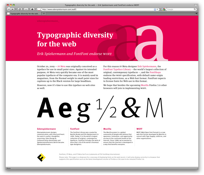
Erik Spiekermann and FontFont show their support for WOFF.
WOFF has the support of a wide spectrum of the type community; from peers such as Emigre, Hoefler & Frere-Jones, Commercial Type, etc and larger foundries such as Linotype and Monotype… it has also gained the support of Mozilla in their release of Firefox 3.6. We hope and expect that WOFF will quickly gain support in other major browsers as we support, endorse and expect to license our library for use on the Web in the WOFF format in the future.
We have light at the end of the tunnel, but until the foundries and developers hash it out—and the all major browsers begin to support the new format(s)—we’ll have to wait patiently.
Fortunately we do have some other options.
Fonts as a service
A relatively new concept in font embedding is the font subscription service. Launching publically this week, Typekit is at the forefront of the concept which licenses fonts on a monthly ($7 - 49 USD) or yearly ($25 - 250) basis. With TypeKit, you are essentially ‘renting’ fonts instead of purchasing them. Behind the scenes, the service takes advantage of what the browsers already support—unprotected font embedding—and adds a layer of obfuscation to deter potential font thieves.
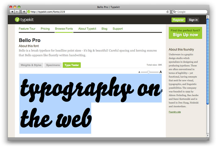
One of the gems from Typekit, Bello Pro by Underware.
Typekit currently features fonts from several independent font designers, but you are out of luck if you hope to use any mainstay like Futura or Gotham. Much like the limited nature of web-safe fonts, you have to design using a limited selection of fonts (that you probably would never use otherwise) to take advantage of the service.
That said, as the Typekit library grows and gains support from other foundries, it should become a much more viable option (in the interim). We can also expect some yet to be seen competitors pop up.
Foundries themselves are also getting in on the action
Typotheque, an independent foundry based in the Netherlands, recently launched their own font subscription service. We got in touch with Peter Bilak of Typotheque, who explains:
We've been running a type foundry for 10 years now, focusing on developing new fonts and licensing them directly to users… Many type foundries are taking cautious stand, and wait to see what will happen. We decided to be active and influence the way fonts are being served.
Claiming the service works in 95% of browsers, users have the ability to take Typotheque’s fonts for a test drive before licensing at one-time cost of around $25 USD each (depending on the font). As a small foundry the selection is slim, but if you are in the market for one of Typotheque’s multilingual fonts it sounds like it could be a good solution.
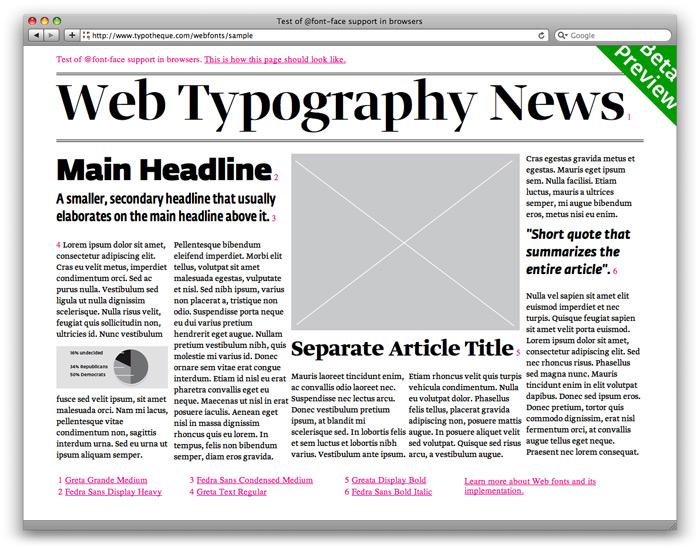
A demo showing Typotheque’s range of web fonts.
As Bilak admits, however, the solution is not perfect. “There is still a lot of work ahead of us—we want to cover the missing gaps, support of fonts for the iPhone, improve font rasterizing on the Windows, implement the new web font format (WOFF), and lastly learn from the user feedback…”
Will other foundries follow suit? We asked around, but it seems most are keeping their plans under wraps for now:
We've got all kinds of thoughts and plans about web typography, but nothing we're ready to talk about just yet.
-Jonathan Hoefler, Hoefler & Frere-Jones
What about open source?
Copyright protection issues are clearly the last major hurdle in making embedded web fonts a reality. To avoid this, some designers have (passionately) decided to go with free open source options.
With plenty of attractive typefaces out there, even popular sites like Boing Boing decided to give open source fonts a whirl. In a redesign last month, the site incorporated the open source BPreplay (via CSS3’s @font-face) in what Webmonkey called “a daring experiment.”
An experiment that didn’t go so well…
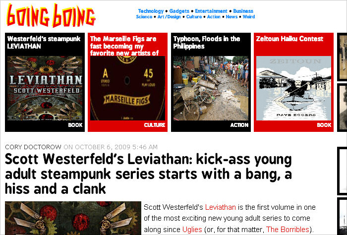
Boing Boing’s (short lived) redesign, as shown in Internet Explorer, using open source typeface BPreplay designed by George Triantafyllakos.
The result was hordes of angry Boing Boing fans complaining that the new headline font was ‘ugly,’ ‘an abomination’ and ‘plain nasty.’ Of course, the culprit wasn’t really the font, but rather how different it looked depending on which browser and operating system the viewer was using…
The problem is that while modern browsers, like the latest versions of Safari, Firefox, Opera and Google Chrome, all support @font-face, the Windows XP operating system often doesn’t have anti-aliasing turned on by default. The rule, which is still part of CSS3’s draft specification, is also not supported by any version of Internet Explorer.
Within a few days, Boing Boing completely abandoned its short-lived redesign.
Although it seems Internet Explorer was to blame, perhaps John Gruber was right when he said, “The fonts you’re allowed to embed legally aren't worth using; the fonts that are worth using aren't embeddable.”
I guess in the meantime, we’ll just keep hacking away.
No doubt CSS3 will be a hot topic at this year’s Future of Web Design conference in New York City. idsgn will be there covering the event, be sure to check it out if you are in the area November 16-17th.
Filed under: typography
Comments