76ers take it back to '77
Comments: +
June 24 2009
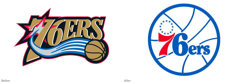
NBA basketball team The Philadelphia 76ers are officially making a switch back to their classic 1977 logo. Making fans happy and adding to the growing list of brands going ‘retro’ in 2009.
Introduced in 1977, the vintage blue and red logo was used famously during the Sixers' heyday, including their 1982-83 championship run. In 1997 it was replaced with the ‘modernized’ gold and silver logo, which has been in use ever since.
I'm no sports fanatic but I'm happy to see the classic logo come back. We've already seen leading soft drink and snack companies do it, so why not professional sports teams? The '77 logo still looks clean and refreshing next to the mess of swooshes and stars that reek of bad 90's design. I'm only amazed it took them this long to make the switch.
By bringing back the old Sixers logo, we are connecting the past with the future. This logo evokes memories of some of this franchise's proudest moments. We also made this change because we understood how much this logo means to our fans, this franchise and to our city. The fans had a big input on this decision. We're excited and we want the entire City of Philadelphia to be excited for Sixers basketball.
-Ed Snider, Comcast-Spectacor Chairman
The Sixers will introduce a new secondary logo and wordmark at a later date, along with a new court design and uniforms later this summer. The uniforms may look something like the ones worn during the 2002-03 anniversary season (right):
, vintage uniform (right)")
To read some reactions from the Philadelphia and NBA community, check out the official press release.
Filed under: branding
Comments