Know your type: Cheltenham
Comments: +
February 3 2010
")
Designed by an architect, and known today as the face of The New York Times, Cheltenham is the seventh installment in our ‘Know your type’ series.
American architect Bertram Grosvenor Goodhue was known for his involvement in the gothic revival at the turn of the 20th century, designing countless churches and buildings, including the Nebraska State Capitol and the Los Angeles Public Library.
But before that, he designed a typeface.
Building the foundation
Goodhue became involved in the Arts and Crafts Movement early in his career. Though trained as an architect, he published a short-lived quarterly art magazine and participated in illustration and book design, including An Alphabet of Celebrities.
In 1896, Goodhue applied his talents to type design when he was commissioned by Daniel Berkeley Updike of the Boston-based Merrymount Press to design lettering for a church altar book. Following the success of that project, fellow printer Ingalls Kimball commissioned Goodhue to design a new typeface for the private use of his New York-based Cheltenham Press. Kimball sketched the basic weight while Goodhue completed the drawings, for what would become the namesake Cheltenham typeface (or ‘Chelt’ as it was often referred to by American typesetters).
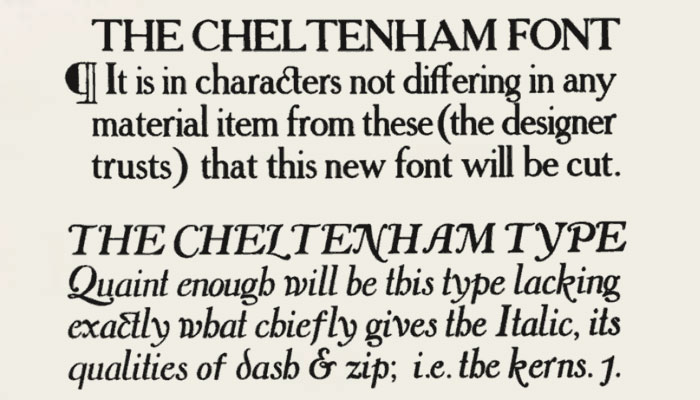
Original sketches of Cheltenham by Bertram Goodhue (Source: Anatomy of a Typeface)
It was Goodhue’s intent to create a book type in which legibility would be the dominant element. He therefore designed an alphabet of rather monotonous construction, including serifs similar to the Clarendon style of fifty years earlier. It was in the treatment of ascenders and descenders that Goodhue’s premise was most evident. Believing that the upper half of a line of type is more important for recognition, the designer lengthened the ascenders and shortened the descenders of the letters. This feature also allowed for economical composition, since leading could be dispensed with, even in longer-than-average lines.
—Alexander S. Lawson, Anatomy of a Typeface, 1990
Creating a family
In 1902, Goodhue’s design was purchased by the American Type Founders (ATF). Influential type designer Morris Fuller Benton refined the typeface, developing a large variety of condensed and expanded widths for its release. Cheltenham was among the first typefaces to be released as a type ‘family.’

Cheltenham enjoyed massive success in the early 1900s, largely due to the robust variety of widths and styles it offered. By 1915, Benton had cut twenty-one variations of Cheltenham, leading the typeface to be considered one of the most widely known in the United States.
The typeface was a favorite among newspapers, and was notably adopted as a headline typeface for The New York Times around 1906.
")
, ATF calendars 1927 - 1932 (Source: mehallo.com)")
Despite early success, with the rise of advertising typography in the following decades, Cheltenham saw a decline in popularity—even becoming somewhat controversial among designers. The subject of numerous trade publications in the post-World War II era, Cheltenham was criticized for being ungainly. Even today, it seems designers either love it or hate it.
Owing to certain eccentricities of form, it cannot be read comfortably for any length of time. Its capitals are better than its lowercase, which is too ‘perpendicular’ in effect—a fault appropriate to so distinguished an architect of Gothic buildings! It is, however, an exceedingly handsome letter for ephemeral printing.
—Daniel Berkeley Updike, Printing Types, Their History, Forms, and Use, 1922
’70s revival
Considered dated by the 1970s, Tony Stan was commissioned by the International Typeface Corporation (ITC) to revitalize the design. Attempting to improve its aesthetics, Stan dramatically enlarged the typeface’s x-height, evening out the previously top-heavy design.
Originally released in Book and Ultra, ITC Cheltenham was quickly expanded (due to popularity) to include Light and Bold, with companion italics and condensed designs for each weight.
 and ITC Cheltenham (below)")
ITC calls their version a “straightforward, no-nonsense typeface that will serve ably in both text and display applications,” although it is criticized by Cheltenham purists for stripping out the qualities that had made it so unique.
Other foundries, including Bitstream, Font Bureau, URW++, Scangraphic, Elsner+Flake, and Tilde, have released more traditional digital versions of Cheltenham.
The Times are changing
For nearly a century, The New York Times had been using Cheltenham in conjunction with at least five other typefaces (including Latin Extra Condensed, News Gothic, Century Bold Italic, and Bookman) for front page headlines. According to The New York Times, the variety was common for newspapers in the early 20th century because of the cost of stocking full ranges of metal type within a family.
That changed in 2003 when The Times settled on a single family, replacing the varied typefaces with roman, italic, and various weights of Cheltenham. A narrow variation is also used for their one-column headline on Page A1.
Under longtime art director Tom Bodkin, The New York Times commissioned type designer Matthew Carter to rework the century old typeface, with the exception of Cheltenham Bold Italic. Carter’s version, dubbed ‘Times Cheltenham,’ remains proprietary to The Times.
")
The Times manages to make Cheltenham—designed in 1898!—actually sound bracingly progressive. Thus the paper successfully fulfills that most frustrating common of client briefs: to simultaneously signal modernity and heritage.
—Michael Bierut, Design Observer, 2003
Cheltenham made the leap onto the web recently with the launch of Times Skimmer, an online news browser which uses Typekit to deliver the newspaper’s renowned typeface (instead of the web-safe fallback, Georgia).
Usage

Cheltenham in use: L.L.Bean logo and catalog (Source: brendaarnall.typepad.com), Celebration Florida logo by Pentagram, Florida’s Natural orange juice packaging, Orchard Supply Hardware logo, ‘Don’t Mess with Texas’ campaign, Farmer’s Market sign (Photo: joeclark, Flickr), La Tisanière tea packaging, letterpress stationary (Photo: anemoneletterpress, Flickr), record label circa 1921 (Source: tedstaunton.com)
Also see:
- Know your type: Gill Sans
- Know your type: Clarendon
- Know your type: Gotham
- Know your type: Futura
- Know your type: Verlag
- Know your type: Din
Filed under: typography
Comments